

UPDATED: Instant Reaction to the OTHER "HC" website (that's Hillary Clinton, not Health Care)
Sun, 04/12/2015 - 3:22pm
OK, today's the Big Day; Hillary Clinton has Finally, Officially, For Realz! announced that yes, she is indeed running for President of the United States in 2016.
Everyone's going nuts about it at the moment (even though it's the worst-kept secret in history). I don't have a whole lot to say about my actual feelings about her running/being the nominee yet, and I haven't even watched the launch video yet, but as a website developer, I do have 3 minor gripes and one observation about her all-new campaign website, HillaryClinton.com:
First, the quibbles:
- First, while "tooltips" (the little pop-up labels when you roll over something) can be useful for link icons which aren't immediately obvious, they should never be used for text links, especially when the tooltip is exactly the same as the link itself (Iowa / Iowa). It obscures the links below it without providing any useful information.
- Second, while translucent overlays can also be very effective, it's a bad idea to do this for drop-down menus, since it tends to make it more difficult to read the drop-down links over the text behind it.
- Third (this is more of an "optics" thing), I'm assuming that IA, NH, NY, NV & SC are the first states to hold their primaries. While I can understand listing them first, she probably should have still listed all 50 states (along with DC, Puerto Rico, Guam, American Samoa & the US Virgin Islands) as well for the whole "reaching out to all Americans" vibe. Grey out the other 45+ links if need be, but list them (double-columned if necessary).
OK, those out of the way, the more interesting thing to me is the new, ultra-mimimalist logo design. Compare the 2016 "Arrow H" logo to her more traditional 2008 version:
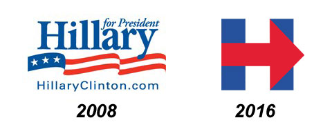 In 2008, she went with the standard, traditional font elements: Red/White/Blue, a wavy American flag and so on. The only thing which distinguished it from any number of other Presidential campaigns is that she went with her first name instead of her last. There were two obvious reasons for that: First, because she was so well-known that she could get away with it (you can only do this if no other major contenders have the same name...Rand Paul is doing RAND! and I presume Jeb Bush will go with JEB! since it's unique and BUSH would be a disaster). The other reason, I'm guessing, is because she was really pushing the "I'm my own person, not running on my husband's coattails!" angle at the time (remember this was before she was Secretary of State, so some people still thought she hadn't "accomplished enough" to run on her own merits yet).
This time, she's going ultra-minimalist: A simple, angular "H" with an arrow pointing forward.
This makes sense for a bunch of reasons, some of which have nothing to do with her campaign specifically. For one thing, the square shape makes the new logo much easier to place into social media avatars, the favicon (the tiny little icon which appears next to the domain name in your address bar) and so on.
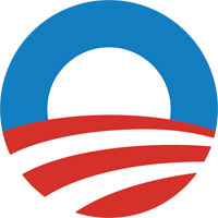 It's also instantly memorable (whether positively or negatively), prints in a large font on a round campaign button. She's obviously hoping that it'll take on the same iconic "branding" status that President Obama's "O with flag-stripe field" logo did in 2008:
The only (significant) problem I have with Hillary's new logo, actually, is that red and blue tend to bleed into each other on print and even web graphics. Obama's logo got away with it because the overlap is pretty minimal, but you can still see a bit of a "ghosting/bleed" effect where the first red stripe meets the blue "O". Hillary's "Arrow H" logo has the colors overlapping in 4 different spots. I probably would've put a thin white border between the places where the blue & red sections meet. Otherwise, it (mostly) works for me, although it might be a bit too heavy-handed...
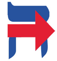
As someone on Twitter noted earlier (I don't recall who), it also looks like the icon for a hospital emergency room entrance. Whether this is a positive or negative thing depends on your perspective, I suppose. On the other hand, "HC" just happens to stand for both "Hillary Clinton" as well as "Health Care", and HC.gov points to HealthCare.Gov, so perhaps she'll use that in the campaign when the subject of Obamacare comes up. Then again, HC.com is owned by Harper Collins Publishers, so perhaps that's an opportunity lost.
 As for the arrow, it can be taken a couple of ways. On the one hand, it's red and pointing to the right, neither of which are concepts you want associated with a Democratic candidate. On the other hand, it's pointing forward instead of backwards (in English at least...it'll be interesting to see whether the Hebrew and/or Arabic version of the logo has the arrow facing right or left...)
UPDATE: One more thing. Notice that on the home page of the website, there's the standard Big Fat Donation form/button. Nothing unusual about that, of course. What is noteworthy, however, is that the dollar amounts on the form (at least the home page version, anyway) only go up to $100. Obviously there will be plenty of fat cats donating gobs more than that (the official maximum individual contribution cap is $2,700 for the primary and another $2,700 for the general election, $5,400 total), but the fact that she's putting a $100 cap on the home page is a subtle but clever way of suggesting that she's "on the side of the little people", "not a creature of Wall Street" and so forth. Whether this is true or not is a separate question, of course. Even on the actual dedicated Donate page it only goes up to $250, and while it gives the option of higher amounts, they aren't listed:
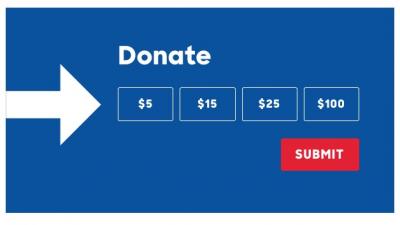
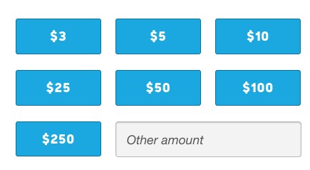
Top: Home Page donation options. Bottom: Dedicated donation page options.
Compare this with, say, Ted Cruz's donation page, which includes the "chump change" options but then immediately jumps up to the four-figure buttons, including the full $5,400 maximum:

Ted Cruz's donation page options
Does this mean that Cruz is more beholden to Big Money than Clinton? Not at all, but Hillary is at least aware that this is an image that she has to be concerned about.
Little things like this may not seem like much, but they're all part of putting together a certain image of the candidate, although it's impossible to tell just how much (if any) impact such things have.
I should note that on the one hand, Rand Paul is also doing the "humble pie" thing by only including options up to $100 on his home page (well, the pop-up screen that appears on occasion, anyway)...but once you get to the actual donation page, you're presented with this:

...along with a huge "odometer/telethon"-style money ticker keeping real-time track of all the donations he's receiving. This seems to be a carryover from his father, who famously raised gobs of money via "moneybombs" in his own Presidential campaigns (even though all that dough failed to gain him much in the way of actual, you know, support).
Speaking of Ted Cruz, let's take a look at his campaign logo, which is also a very obvious attempt to co-opt Obama's brand:

Very slick, and more creative than Hillary's...I presume it's supposed to represent the "flame of liberty" or something along those lines. The problem with it this is that it's also an upside-down burning American flag. While this is certainly an appropriate symbol for Ted Cruz in my view, somehow I don't think that's the image he's going for here.
Advertisement