

UPDATED x5: My best shot at tracking changes in TOTAL U.S. Insurance Coverage Status between 2013 - 2015
Mon, 07/20/2015 - 1:17pm
Before I get to the actual visualization itself, some important disclaimers/caveats:
- Most of the numbers shown are rough estimates.
- All estimates have been rounded off to the nearest 100,000, and in most cases to the nearest million.
- There's a tremendous amount of churn in the U.S. insurance market; tens of thousands of people are shifting around from one form of coverage to another daily.
- Some of the numbers shown were as of a given month, while others were quarterly or even yearly averages.
- In some cases, the estimates shown are extrapolations from earlier hard numbers.
(for example, "Medicare/Medicaid Dual Enrollment" went from 8.6 million to 10.2 million between 2006 - 2011; at that rate I estimated it at roughly 11 million in 2013 and 12 million as of this summer) - Some estimates are composites from several different reliable sources, including the U.S. Census Bureau, the Centers for Medicare & Medicaid, the Kaiser Family Foundation, Gallup, etc.
- I originally attempted to keep everyone in a single column. Needless to say, with 320-odd million people involved, it proved impossible to make this fit on the screen, so I've moved Employer-Sponsored Insurance (which makes up nearly half the total) onto a second column. Even so, I'm pushing it.
As a result of all of the above (not to mention population growth), it's entirely possible--in fact, quite likely--that some of the estimates shown are off by a bit. Employer-Sponsored Insurance, Medicare and Medicaid, in particular, could be too high or low by up to 1-2 million people each given the large numbers involved.
With all of that out of the way, here's my best crack at trying to portray the current healthcare coverage status of every single person in the United States of America as of October 2013 (just prior to the launch of the ACA exchanges and Medicaid expansion program) and July 2015. Comments welcome. I've added some additional notes below the graphic.
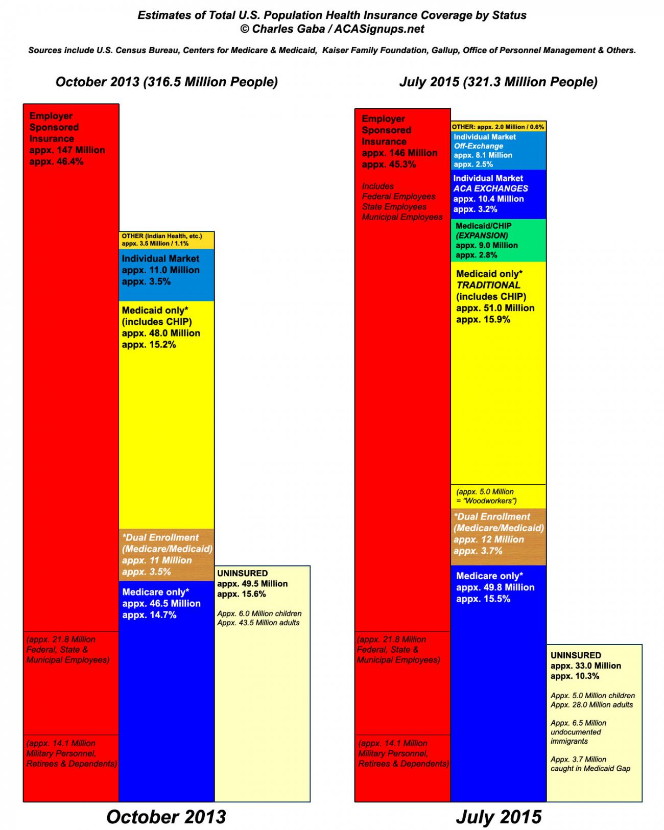
- I believe Employer-Sponsored Insurance has dropped slightly; as far as I can tell, some companies have been kicking employees off, but this has mostly been cancelled out by increased hiring as the economy recovers.
- Remember, the "dual enrollment" factor seriously messes with both the Medicare and Medicaid numbers.
- In addition, remember that other people can be covered by multiple programs as well. For instance, John McCain is a Senior and a Veteran and a member of the U.S. Senate. He's covered by Medicare and the VA, and until the ACA exchanges launched I believe he also had some coverage via the Federal Employee program, though that might not have applied for members of Congress over 65.
- For the 2015 column, the Off-Exchange Individual Market includes both ACA-compliant policies as well as a couple million Grandfathered and/or Transitional policies; there simply wasn't room to break them out.
- Similarly, the 2015 Medicaid section has about 5 million "woodworkers" semi-broken out. Wasn't sure how to treat these.
- The "OTHER" section (around 3.5 million in 2013, down to around 2.0 million today) mainly consists of the Indian Health Service. The 1.5 million reduction in this section was mainly due to around 950,000 low income people being transferred en masse from various state-run programs over to Medicaid "proper".
- My guess is that the numbers which will cause the biggest confusion are the 2013/2015 Uninsured percentages. The recent Gallup survey clearly states that the total uninsured rate was around 18% in Q3 2013 and is now down to 11.4%...however, as I pointed out, that doesn't include children (who make up over 23% of the total population). Since children have always had a much lower uninsured rate to begin with (around 8% in 2013), including them in the mix drops the total uninsured percentage considerably at both points in time.
UPDATE: Julie Rovner correctly points out that while the ESI section includes both federal, state & municipal employees (including the roughly 1.5 million active duty military personnel), it's unclear as to whether it includes the 12.5 million or so non-active duty folks via Tricare. After doing some poking around, I have to assume that they are included there if only because, frankly, there's nowhere else they could be listed. As I noted above, there's a lot of rounding, averaging, etc. flying around, in both the 2013 and 2015 charts, but slicing 14 million people out of any section other than ESI would make the estimates dramatically different from every one of the consensus numbers. So, until I hear better evidence otherwise, I'll assume that they're included as well and will "semi-break out" TriCare/VA folks the way I did with Medicaid "woodworkers".
UPDATE x2: OK, the VA/TriCare question aside, this is about the best vote of confidence I could ask for from Larry Levitt of the Kaiser Family Foundation:
@charles_gaba @jrovner I'd say it's roughly consistent with what we know so far.
— Larry Levitt (@larry_levitt) July 20, 2015
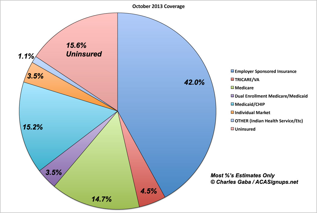
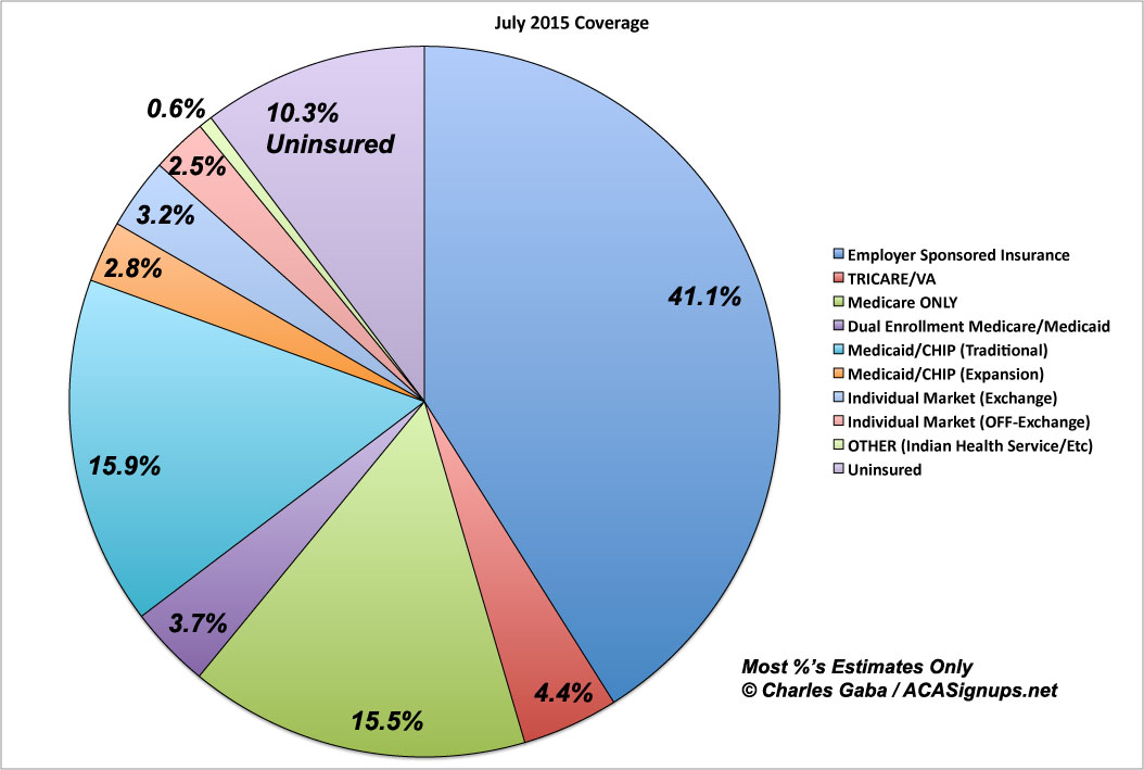
UPDATE x3: I was deliberately avoiding using Pie Charts for this because a) it makes population growth difficult to visualize and b) it's harder to visually compare pie wedges than rectangles, but what the hell (and no, the colors don't match the above; this is a quickie using Excel's default settings):
UPDATE x4: Lynn Blewett of SHADAC points out that the 2014 National Health Interview Survey shows an increase in total private insurance enrollment, and is pretty sure this includes an increase in Employer-Sponsored Insurance. However, Levitt seems to indicate that this is more on the individual market side, not ESI specifically.
As I noted above, most of these numbers are still pretty fuzzy, so it's entirely possible that either one is correct (or, for that matter, that both are...it's possible that ESI has gone up slightly and the individual market has also gone up, just a couple million fewer than shown above). However, neither of them (nor any of the several other respected healthcare journalists/analysts who've commented so far) have indicated that I'm significantly off on anything above, which suggests that the overall picture is reasonably accurate. I'm hoping to do an updated/tweaked version of these graphs every quarter or so; the next one will likely be just prior to the 2016 Open Enrollment Period which starts on November 1st.
@khemp64 @charles_gaba @larry_levitt Don't forget NHIS early release - shows increase in ESI. http://t.co/3waIFXqHXv
— LynnBlewett (@LynnBlewett) July 21, 2015
@LynnBlewett @khemp64 @charles_gaba I think it shows private insurance growing, not necessarily ESI.
— Larry Levitt (@larry_levitt) July 21, 2015
UPDATE x5: Per a suggestion by someone in a different thread, I've modified the "bar" chart by moving the Uninsured section over to its own, separate column. This makes the chart even more readable by shortening it, while also making it easier to compare the key change: The reduction in total Uninsured.
Advertisement