

GET YOUR DATA GEEK ON: Final OE3 ASPE Report released (PART TWO)
Sat, 03/19/2016 - 6:01pm
SORRY ABOUT THE DELAY!! I posted Part One on March 11th and planned on posting Part Two last weekend, but the week kind of got away from me...
In Part One of my analysis of the final, official OE3 ASPE report, I looked at the grand total nationally, the final state-based exchange numbers, revisited the BHP/pre-purged QHP factor, and also took a quick peek at some other odds & ends. Here's my long-overdue look at the rest of the report:
Re-Enrollments:
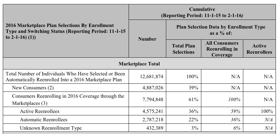
- In 2015, appx. 6.1 million people ended up renewing their policies nationally (4.5 million via HC.gov, 1.6 million via the SBMs) out of 6.3 million still enrolled through the end of the year. That's a 97% renewal/re-enrollment rate, which is pretty good.
- In 2016, appx. 7.8 million people renewed their policies nationally (5.6 million via HC.gov, 2.2 million via the SBMs) out of 8.8 million still enrolled through the end of the year. That's down to an 89% renewal/re-enrollment rate...still not terrible, but concerning.
Bear in mind that I was expecting assumed 9.0 million to renew...but I was also expecting about 9.7 million to still be enrolled (ie, I expected a 93% renewal rate out of a higher total). HHS, meanwhile, had a mid-range of 8.1 million renewing out of an expected 9.1 million (89%). The actual numbers were lower on both sides, which isn't a good sign.
The report touts the increased percentage of active renewals (ie, people actually going to the exchange site and choosing their 2016 plan, whether renewing the existing one or switching to a different one. 59% of those who renewed their policies did so actively this year, which is an increase over 2015's 53%...but again, about 800,000 of those people had no choice but to "actively renew" (or drop off the exchanges entirely) since their Co-Ops closed up shop. Still, the more active re-enrollees, the better, even if they stick with the exact same policy as my family did for a third year in a row:
I noted in Part One that the "Young Invincibles" stayed at the same 28% threshold for a 3rd year in a row, confounding hopes/expectations that a higher percentage of younger (and presumably less-expensive-to-treat) enrollees would sign up. As you can see, a bunch of other stats stayed almost exactly the same in 2015 and 2016 as well, including the gender ratio, silver plan selection and APTC (tax credit assistance) percentages:
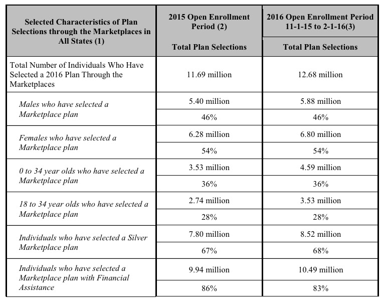
The APTC-receiving number did drop slightly this year (86% to 83%), but this varies a bit throughout the year as the attrition level increases. Again, however, the only major reason to enroll via the exchanges is FOR the tax credits anyway, so I've never understood why people expected a huge number of full-price enrollees to sign up in the first place (the exceptions to this are DC and Vermont, both of which require all individual market enrollees to do so via the exchange anyway...but those two combined only amount to a tiny fraction of the national total).
The report breaks out the actual APTC dollar amounts as well...but only for the 38 states on the federal exchange, which is a bit of a bummer:
- More than 8.1 million (85 percent of 9.6 million) individuals that selected or were automatically reenrolled into a 2016 plan through the Marketplaces in the HealthCare.gov states qualify for an APTC with an average value of $290 per person per month (see Table 6 and Appendix Table B1 on page 39).
- The average APTC covers about 73 percent of the gross premium for individuals who qualify for an APTC (see Table 6 and Appendix Table B1 on page 39).
- The average net premium after APTC is $106 per month among individuals with 2016 plan selections through the Marketplaces in the HealthCare.gov states who qualify for an APTC (see Table 6 and Appendix Table B1 on page 39).
It then goes into the "Active Renewal" impact: How much did people already enrolled in exchange policies save by shopping around for a better deal?
- New consumers were more likely to purchase a plan for $100 or less after applying the APTC – 56 percent of new consumers selected coverage with a monthly premium of $100 or less, compared to 51 percent for people actively reenrolled, and 42 percent for those who automatically reenrolled (see Table 8).
This makes sense, not just because of the "active shopper" factor but because new enrollees were more likely to be doing so purely as a way of avoiding the increased financial penalty; they're therefore more likely to go for the dirt-cheapest plan required to get the government off their butts.
- Savings from shopping: On average, those who actively reenrolled and changed plans selected plans for $132 per month after applying the APTC, compared to $174 per month if they had stayed in their 2015 plan (or the crosswalked plan), a savings of 24 percent or $42 per month on average, after applying the APTC (see Table 9).
This is pretty impressive, actually...assuming that the plan that they switched to is very similar to the old one, of course. The problem is that there are so many variables (network size, deductibles, co-pays, etc) across carriers, metal levels and plans that it's impossible to do an apples-to-apples comparison. A 24% average savings doesn't mean much if you're also giving up useful/needed services in the process, of course.
Still, it's safe to assume that enrollees who actively shopped around were also much more likely to take such factors into consideration when doing so.
A slightly more accurate comparison is probably this one:
- Consumers who switched plans within the same metal level during the 2016 OEP saved $40 per month, or nearly $480 annually, relative to what they would have paid if they had remained in the same plan (or the crosswalked plan) as in 2015. Meanwhile, those who switched issuers as well as plans within the same metal level were able to save $45 per month, or nearly $540 annually (see Figure 3 and Appendix Table B5 on page 47).
From my POV, the first of these is probably the most reasonable apples-to-apples comparison: Same carrier, same metal level, but a better plan. Note that the average savings using this benchmark is nearly as high as the "unfiltered" change ($40/mo vs. $42/mo savings).
Moving on...
- THERE'S STILL NOT A PEEP ABOUT THE SMALL BUSINESS (SHOP) EXCHANGE ENROLLMENT DATA on the federal exchange:
The data reported here have been obtained from the information systems of the Centers for Medicare & Medicaid Services (CMS), based on information collected for 38 states using the HealthCare.gov eligibility and enrollment platform. We also obtained more limited data reported to CMS by the 13 states (including DC) that are using their own Marketplace platforms. Data for the Small Business Health Options Program (SHOP) Marketplaces are not included in this report.
That's three years in a row in which the SHOP data is just...missing. No numbers, no percentages, nothing. I have SHOP data for about half of the state exchanges, but zilch for HealthCare.Gov. As with last year, I'm guessing that total SHOP plan enrollment is no more than perhaps 250,000 or so nationally.
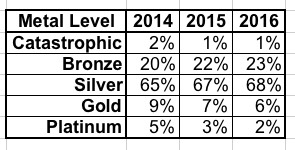
- METAL LEVELS: As you can see, each year, more and more people seem to be realizing that ultra-low-end (Catastrophic) and ultra-high-end (Platinum) plans aren't the wisest way to go, settling on the low- and mid-range (Bronze/Silver) options. My gut tells me that about 1/3 of those choosing Bronze plans would still be better off going with Silver, but the trend so far is actually fairly encouraging on this front:
- What about income levels? We know that around 83% of enrollees qualify for APTC this year, but let's look at the income brackets over all three years:
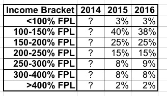
I can't seem to find the income breakout for 2014, but it looks like this has stayed pretty much steady year over year.
Update: Thanks to Andrew Sprung reminding me of the answer to one question I'd forgotten about: Since financial assistance only applies to those between 100-400% FPL, who the heck are the 3% below 100% who are enrolling via the exchanges? That's around 380,000 people this year. I assumed that these were mostly people caught in the "Medicaid Gap", but really, those folks wouldn't be able to pay full price for even the cheapest Bronze policy (perhaps Catastrophic in some cases). Andrew reminded me that legally-present non-citizens (who are barred from enrolling in Medicaid for 5 years) are eligible for ACA tax credits if their income is under 100% FPL.
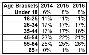
- As noted earlier, the age brackets have barely budged over all three years either:
Hmmm...not much going on here. What about dental plans, which I don't usually pay too much attention to?
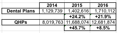
OK, this is kind of interesting. Enrollment in qualified health plans surged by 46% in 2015 followed by a huge slowdown in growth this year (only 8.5%), dental plan enrollment was more steady: Up 24% last year, and another 22% this year. This suggests that the standalone dental plans are being looked at more closely as time goes on. On the other hand, some QHPs include dental coverage anyway, so that's an unknown factor as well.
- Website/Call Center Traffic: Again, this isn't a metric that I usually spend much time on, but it's kind of interesting to see how web traffic has changed. I've combined the numbers for each of these from both HealthCare.Gov as well as the various state-based exchanges:
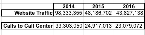
According to this table, visits to the dozen or so websites actually dropped in half from 2014 and 2015, and dropped slightly further for the 2016 enrollment period. At first this seems strange, as you'd expect traffic to increase to coincide with enrollment...but it makes perfect sense.
Keep in mind that in October 2013, when the exchange website launched, most of them were disasters technologically, meaning that people had to revisit the sites multiple times just to get through the process. In addition, there was a tremendous amount of general curiosity about the websites from both supporters as well as detractors, so it's not surprising that once the server/coding/bandwith issues were worked out and the novelty of the whole system faded, traffic actually dropped off substantially. In addition, 2014's open enrollment period lasted 6 months (6.5 months if you include the 2-week "overtime" period), while it was only 3 months in 2015 and 2016.
In short: In 2014, there were 12.3 website visits per enrollment; in 2015 this dropped down to just 4.1 visits per enrollment, and this year it was down further, to just 3.5 apiece. Something similar is happening with the call centers, although not nearly as dramatically: From 33.3 million calls for help in 2014, to 24.9 million, to just 23 million this year (4.2 apiece / 2.1 apiece / 1.8 apiece).
Both of these are good things, because it means that it's becoming increasingly easier/faster/less confusing for people to go through both the research and enrollment process. To me, the ideal goal would be a 2:1 ratio for website traffic: Once for people to window-shop, a second visit to actually enroll.
Everything after this gets into the STATE BY STATE data. In addition, as I noted in Part One, CMS also happened to release the December 2013 / Q4 EFFECTUATED enrollment report on the same day as the ASPE report, so it makes sense to bundle those together.
Look for all of my state analysis stuff in PART THREE (which I promise won't take another 8 days to compile!)
Advertisement