

KFF confirms higher benchmark rate hikes next year, but with lots of caveats
Wed, 06/15/2016 - 10:25am
After crunching the numbers for the requested rate changes (OK, rate hikes) across 31 states & DC, it looks like it's gonna be awhile longer for the remaining 19 states to post their rate filings publicly. For instance, while Michigan's SERFF database has had a whole mess of rate filing stuff posted for weeks now, none of them appear to include the two pieces of crucial data that I need for this project: The actual requested average percentage rate changes and the actual number of current lives covered by those policies...and likely won't for at least another week:
2017 Rate Filings - Individual Products - ALERT
The 2017 Individual Product filings are not yet complete. Partial filing information was submitted by issuers on May 9, 2016.
DIFS would caution evaluation of 2017 rate changes based on current filing data. Issuers were required to file pro forma rates by May 9, 2016 to comply with CMS initial submission requirements. These pro forma rates may or may not resemble an issuer’s proposed rates for 2017, which are not due to DIFS until June 20, 2016.
With that in mind, this seems like a good point to take a breather and see where things stand. The 31 states (+DC) that I've analyzed represent either 70%, 72% or 73% of the country depending on whether you base it on the total population, the size of the individual insurance policy market or the total number of QHP selections via the exchanges. I've broken the 3 tables into separate images below to avoid having to click for a higher res version:
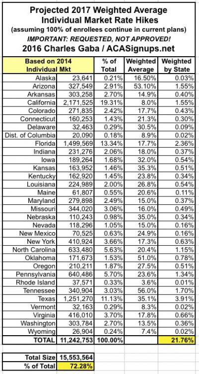
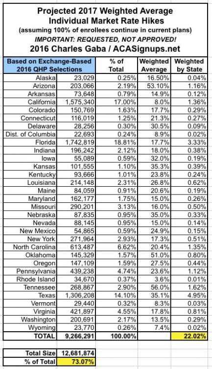
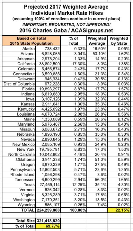
What's rather remarkable to me is how close all three methods are to each other, considering the wide variety of demographic, economic and legislative policy factors from state to state.
Anyway, it's important to remember that my "Rate Hike Project" attempts to include all ACA-compliant policies and all people currently enrolled in those policies which are scheduled to be available next year, whether on or off the exchanges, at all metal levels. This may be the most encompassing attempt at such an analysis, but is it the best way of doing it?
That depends on your point of view. Remember that around 9.2 million (give or take) people are receiving APTC assistance to cover their monthly premiums (around 83% of exchange-based QHP enrollees, which are likely down to around 11 million as of today). For them, as well as any new enrollees next year who will qualify for APTC, a more important benchmark to look at would be...the benchmark plans. Again, the federal ACA exchange tax subsidies are calculated using a complicated formula based on the second lowest-priced Silver plan in each coverage area, called the "benchmark plan". In addition, about 2/3 of all exchange enrollees chose Silver plans in general, so price changes there definitely have the biggest impact.
WIth that in mind, the Kaiser Family Foundation has posted their own analysis of what to look for with Silver plan rate changes across 14 major metropolitian areas to see what the trend is:
Marketplace premiums under the Affordable Care Act (ACA), already a subject of perennial interest, have gained even more attention amid unfavorable financial results from some insurers, as well as initial reports of steep premium increases requested for 2017. Several factors will influence how premiums will change in 2017, and there is reason to believe that increases will be higher than in recent years.
Many of the initial reports of premium increases for 2017 have been based on anecdotal examples or averages across insurers. This brief takes a different approach, presenting an early analysis of changes in insurer participation and premiums for the lowest-cost and second-lowest silver marketplace plans in major cities in 13 states plus the District of Columbia where complete data on rates is publicly available for all insurers. Using this information, we are able to calculate the premium a specific person might pay without a premium tax credit, and take into account new plans entering the market. It follows a similar approach to our analyses of 2014, 2015, and 2016 marketplace premiums. The two lowest-cost silver plans are significant because they are the most common plan choices in the marketplaces, and the second lowest-cost plan is the benchmark used to calculate government premium subsidies.
While we cannot generalize to all states until more data become available later this year, in most of these population centers, the costs for the lowest and second-lowest silver plans are, in fact, increasing faster in 2017 than they have in previous years. Based on insurer rate requests, the cost of the second-lowest silver plan in these cities will increase by a weighted average of 10% in 2017. Last year, premiums for the second-lowest silver plans in these areas increased 5% following review by state insurance departments. There is substantial variation across markets, with premium changes for second-lowest silver plans ranging from a drop of 13% to an increase of 18%. Premiums for 2017 are still preliminary and could be raised or lowered through these states’ rate review processes.
They go on to post several tables/graphs and a bunch more analysis. To me, this is the key point for those receiving APTC assistance only:
These premium changes do not reflect what marketplace enrollees receiving premium tax credits will actually pay. Most marketplace enrollees receive premium tax credits, which means that they do not actually pay the entire premium but make a contribution based on a percentage of their incomes and family sizes to enroll in the second-lowest silver plan.
In 2016, a 40-year-old single enrollee making $30,000 per year would have paid about $208 per month in most areas of the country, and a similar person would pay approximately the same in 2017. (Although premium caps are increasing for 2017, the poverty guidelines are also changing such that a single person making $30,000 will be at a slightly lower percent of poverty than he or she would be this year. These two changes in effect cancel each other out, leaving monthly payments for the benchmark plan very similar from year-to-year.) However, in order to take advantage of this stability in premium payments, enrollees may need to switch plans to the new benchmark silver plan.
...As was the case last year, the insurers that had the lowest premiums in 2016 are often no longer one of the two lowest-cost silver plans in 2017. This underscores the importance of enrollees actively shopping each open enrollment period.
Last year, the effective average rate hike ended up being only around 4% for those receiving APTC...but much of that was due specifically to people shopping around and often switching to a new policy, whether via the same carrier or a different one. The same will presumably be the case for 2017 as well, although instead of 4% hikes, theirs might be somewhat higher.
In other words, the real problem isn't so much those 9.2 million or so (perhaps over 10 million next year?) who are receiving financial assistance; the larger issue is the other 9-10 million people who are paying full price for their policies, whether on or off the exchanges. They're the ones who are looking at bearing the full brunt of the premium increases. Kaiser concludes that the requested increases across these 14 cities averages around 10% for the benchmark plans, vs. the 22% weighted average I'm finding for all ACA-compliant plans across over 30 states.
Again, there are still a lot of caveats at play here, ranging from the missing 19 states to the million or so exchange enrollees who will have to shop around whether they want to or not (due to some plans being discontinued or some carriers pulling out of their states entirely, especially UnitedHealthcare). Other factors like deductibles, co-pays and network size aren't accounted for here, and again, all of these rate hikes are requested only; some of them may be dramatically lowered by regulators (although many will be approved as is, and some might even be increased further).
Advertisement