

Y oh Y do graphs keep messing up the Y-axis??
Tue, 08/02/2016 - 9:52am
I've written a number of times about the irritating tendency of media outlets (and even the original data source itself) posting graphs & charts which are presented in highly misleading ways...even if the data itself supports the larger headline. The usual target of my ire is Gallup itself, which keeps presenting their quarterly Uninsured Rate graphs like so:
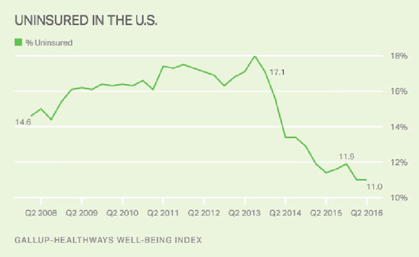
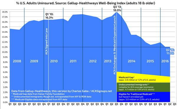
By cutting off the first 10 percentage points, this makes the uninsured rate drop since the ACA was implemented seem far more impressive than it already is. I support the ACA, but still prefer the situation be presented as accurately as possible. As a result, I keep reformatting Gallup's data like so (I also add some additional data points for further context):
I'm bringing this up again today because Greg Dworkin took note of the opposite problem yesterday (h/t to Richard Mayhew for calling his tweet to my attention):
guys, could you make the y axis a bit bigger? That’s an 8 point lead. pic.twitter.com/SnlxrNkPwz
— Greg Dworkin (@DemFromCT) August 2, 2016
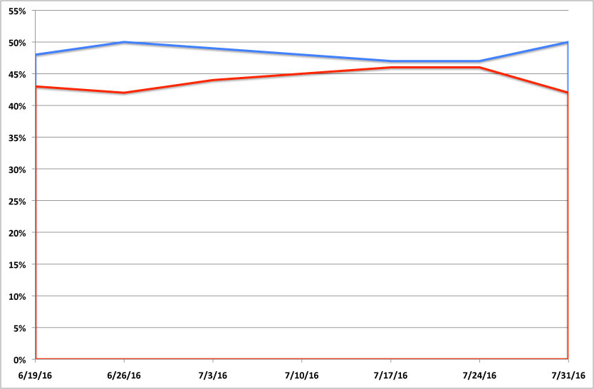
Here's the image that he's referring to:
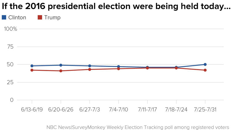
As Greg notes, this has the exact opposite effect of the Gallup charts: Instead of making the difference seem larger than it really is, by cramming in the full 100% range along the Y-axis, the SurveyMonkey tracking poll makes it look like Clinton and Trump are locked in a much tighter race than they actually are.
There's several better ways this graph could have been presented.
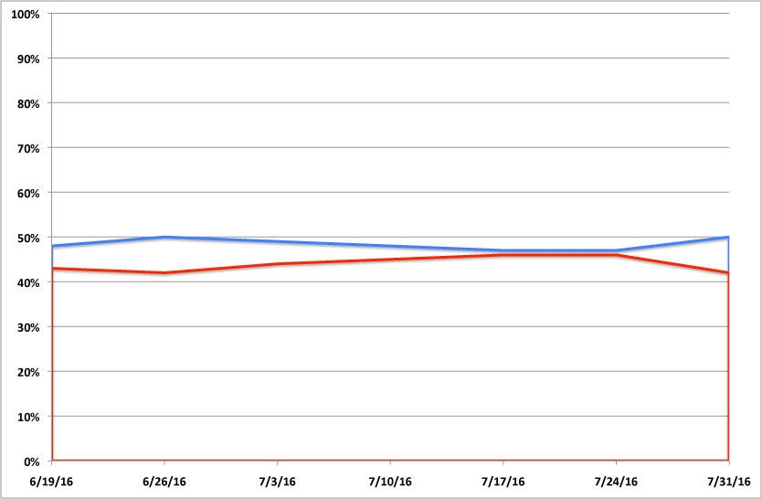
- They could've simply made the whole thing taller (forgive me, my own Excel chart tool skills aren't the best in the world and I didn't want to spend too much time on this):
- They should have cut off the upper half of the Y-axis, since obviously neither candidate is anywhere close to 100%:
- Finally, if they absolutely had to save as much vertical space as possible, they could have cut out a portion of the Y-axis below the data in such a way that it's still obvious that a chunk of the scale is missing (again, I haven't done the best job of this myself, but you get the idea):
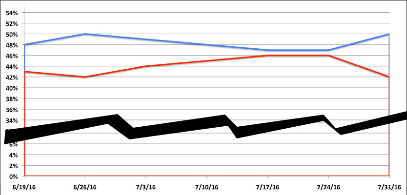
The point is that all three variants make it much more obvious how dramatically things have changed in just the past week or so.
Advertisement