

UPDATE: How have individual market enrollment retention patterns changed since pre-ACA days?
Thu, 05/17/2018 - 5:37pm
5/25/18: SEE IMPORTANT UPDATE BELOW.
I suspect that even within the healthcare wonk community, this particular bit of information is only going to be of interest to a small number...but I'm one of them, and it's my site, so there you go.
A couple of years ago I got into a rather wonky discussion with L.A. Times reporter Michael Hiltzik and Michael "No one hates Obamacare more than me" Cannon of the CATO Institute about Special Enrollment Periods:
The insurance carriers have been getting the vapors of late because they're absolutely certain that uninsured off-season Special Enrollment Period (SEP) enrollees are gaming the system, taking advantage of the poor multi-billion dollar insurance carriers' hearts by tracking down the list of Qualifying Life Events (QLEs), shoehorning themselves in so that they're eligible for one of them (or simply lying about having one), signing up for coverage during the off-season, racking up gobs of expensive medical procedures and then kicking the policy to the curb without so much as a promise to call them the next day.
I've already discussed this issue ad nauseum, including point/counterpoints with folks like Richard Mayhew of Balloon Juice, Michael Hiltzik of the L.A. Times and Michael "King v. Burwell" Cannon of the CATO Institute.
My takeaway is that yes, people "gaming" the system probably is happening to some extent, but that there are some fairly simple steps which can be taken to prevent this (or at least to reduce it considerably).
At the time, the Obama Administration wasn't doing a particularly stringent job of verifying whether or not people who enrolled during the off-season were actually eligible or not; it was mostly based on an honor system. This soon became a moot debate, however, becuase starting shortly after this, then-CMS Administrator Andy Slavitt announced that among the new policies being put into place was this:
Today, we are announcing another step that will enhance program integrity and contribute to a stable rate environment and affordability for consumers: a new Special Enrollment Confirmation Process in the 38 states using the HealthCare.gov platform. Under the new process, all consumers applying through the most common special enrollment periods will need to submit documentation to verify their eligibly to use an SEP. This represents a major overhaul of the SEP process. You can read more about the Special Enrollment Confirmation Process here.
Special enrollment periods are an important way to make sure that people who lose health insurance during the year or who experience qualifying life changes have the opportunity to enroll in coverage. We are committed to making sure that special enrollment periods are available to those who are eligible for them. But it’s equally important to avoid misuse or abuse of special enrollment periods.
This change in HealthCare.gov’s special enrollment period process does not restrict anyone’s access to a special enrollment period who is rightfully able to enroll in coverage. But consumers will need to be sure to provide sufficient documentation to establish their eligibility. If an individual doesn’t respond to our notices, they could be found ineligible to enroll in Marketplace coverage and could lose their insurance.
They ramped up the new verification system over the next year or so, and now it's my understanding that anyone trying to enroll during the off-season does indeed have to upload the appropriate verification data.
However, this did raise questions about ACA policy enrollee retention, attrition and so forth. During the first Open Enrollment Period, there was a ton of fuss and bother from the GOP over "How Many Have Paid?", referring to how many ACA exchange enrollees paid their first monthly premium. This was such a big deal at the time that the House GOP Commerce Committee even put out a big report claiming that only 2/3 of enrollees paid up...which turned out to be a big flaming pile of garbage.
In the end, it turned out that roughly 85-90% of those who select Qualified Health Plans (QHPs) from the ACA exchanges do go on to pay their first montly premium. The ratio has improved a bit since then and is now roughly 90% overall.
However, that still leaves the issue of monthly attrition and retention--that is, how many people pay for one or two months but then drop coverage after that. I knew, for instance, that 8.0 million people selected QHPs during the first open enrollment period (which ended in mid-April), and that about 88% of them (7.0 million) paid their first premium...and I knew that around 6.3 million people were still enrolled in December...but that doesn't mean that those 6.3 million were all part of the original 7.0 million, since around 8,000 people per day were still enrolling throughout the off-season, which means a large number had to be dropping coverage as well.
Fortunately, last summer I came across an internal CMS powerpoint presentation which gave the exact enrollment, effectuation, attrition and retention numbers for each month throughout 2015. It only covers the 37 states covered by HealthCare.Gov that year, and it only includes that year, but it still gives important insight into ACA exchange enrollment/effectuation patterns:
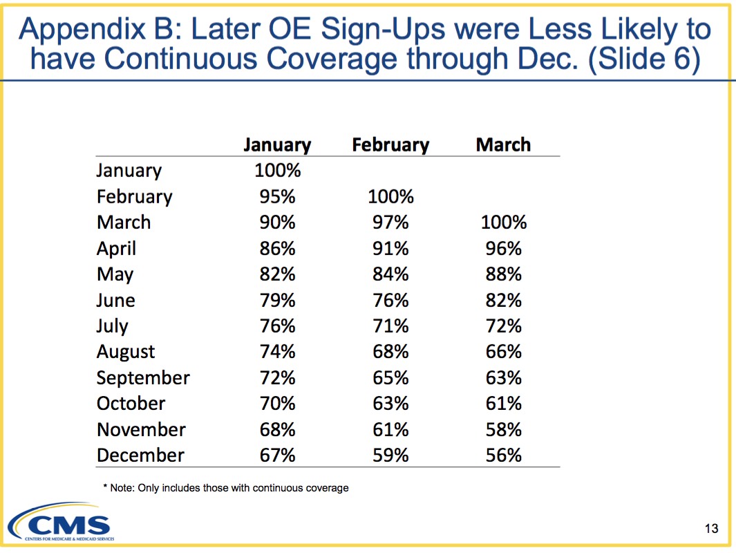
So there you have it: Out of those who enrolled starting in January, exactly 2/3 of them (67%) stuck it out all the way through until the end of December...whereas those who didn't start coverage until February or March were indeed somewhat more likely to drop their coverage faster (the 56% still enrolled in December for those who started enrollment in March has to be compared to the 70% still enrolled in October who started enrollment in January).
This still left one important question, though: How does this compare to the pre-ACA individual market? You have to have a basis for comparison.
Until today, I had nothing to compare with...but now I do, thanks to commentor "M.E.", who pointed me towards this 2006 report from the Agency for Healthcare Research and Quality at the Health & Human Services Department:
Nationwide, 10.9 million non-elderly individuals were covered by individual private health insurance for at least one month during 2006, 7.0 million were covered for the full year and 3.9 million were covered for part of the year (figure 1). These figures represent a small proportion of the non-elderly population. Only 4.3 percent of the non-elderly population had individual private coverage at some point during 2006, 2.7 percent had full-year individual coverage and 1.5 percent had part-year individual coverage (figure 2).
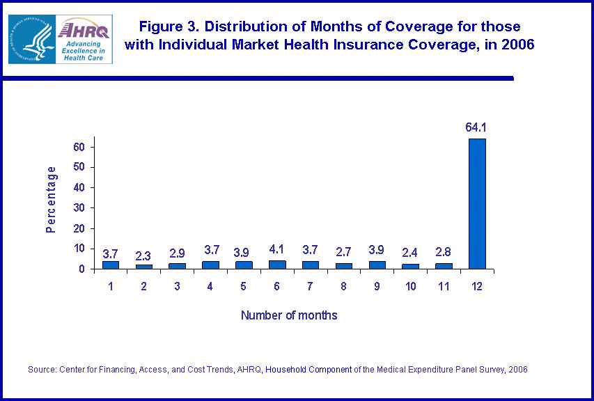
Figure 3 shows the distribution of the number of months of coverage for the 10.9 million individuals with individual health insurance at some point during the year. As seen in figure 3, 64.1 percent of individuals had individual coverage for the full 12 months and the remaining months were evenly distributed from 1 to 11 months.
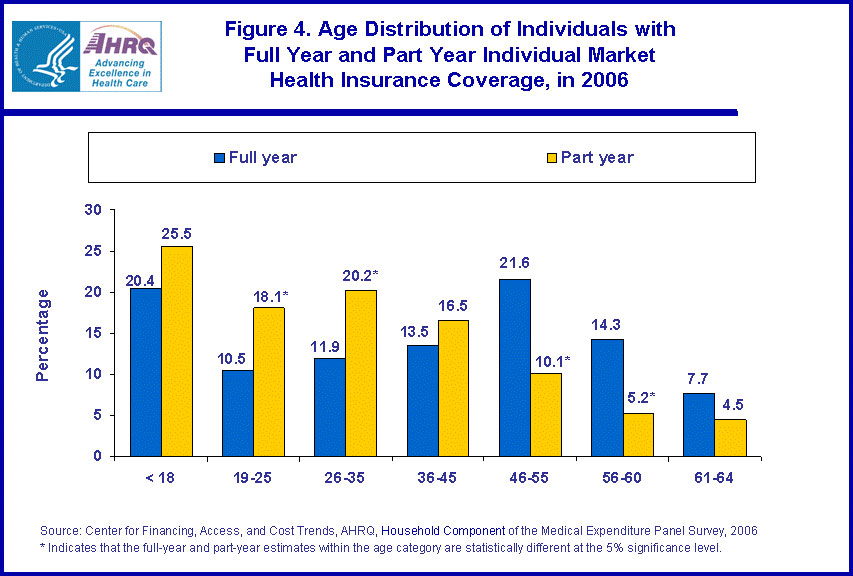
Figure 4 shows the age distribution for persons covered by individual private health insurance for the full year and for part of the year. Individuals with part-year individual coverage were more likely to be between the ages of 19 and 35 than those with full-year individual coverage. Those with full-year coverage were more likely to be between the ages of 46 and 60 than those with part-year coverage. For example, 18.1 percent of those with part-year coverage were 19-25 years old compared to 10.5 percent of those with full year coverage. In contrast, 21.6 percent of those with full year coverage were aged 46-55 compared to 10.1 percent of those with part-year coverage.
Table 1 provides additional information on individuals with part-year individual coverage. The average length of coverage for those with part-year individual health insurance was 5.9 months. Of those who obtained part-year individual health insurance, 43.9 percent were able to obtain health insurance from other sources that enabled them to have coverage for a full 12 months. Most of this coverage came from employers--40.1 percent of those with part-year individual coverage had full-year coverage through a combination of their individual health insurance and employer-provided coverage. In fact, 9.8 percent of individuals with part-year individual coverage (about one-quarter of the 40.9 percent with some employer provided coverage) had employment-related coverage for the full year.
This is fascinating stuff for those who are interested in such things. The age distribution chart is the first time I've seen that data presented anywhere. The main point, however, is that in 2006, years before the ACA went into effect (heck, even Romneycare hadn't ramped up in Massachusetts yet!), only 64% of individual market enrollees stuck it out for all 12 months of the year.
In other words, the 12-month retention rate trend since the ACA exchanges launched is actually slightly higher than it was before the ACA.
There. Glad I finally put that issue to bed.
UPDATE 5/25/18: As noted above, I screwed up royally on this post.
Over at Forbes, Chris Conover (with whom I've butted heads on a few occasions, but with whom I've also developed a mutually grudging respect for) has called me out for making a critical mathematical/logical error in my calculations.
Here's his basic point:
Mr. Gaba committed a simple mathematical error in concluding that what happened in the Obamacare exchanges mirrored the pre-Obamacare experience. He correctly observed that 67% of Obamacare enrollees who signed up in January 2015 retained their coverage through December of that year. He then correctly observed that 64.1% of people who ever enrolled in the non-group market in 2006 had coverage for 12 months. His error was in comparing these two numbers, since they do not have the same denominator.
- The 67% figure [2015] is based exclusively on individuals who enrolled in January 2015 and completely ignores all other people who enrolled in subsequent months; it says that 2/3 of this group ended up having coverage for all 12 months of the year.
- In contrast, the 64.1% figure [2006] is based on all people who ever enrolled during the calendar year, not just January; it says that nearly two-thirds of this (obviously larger) group had coverage for all 12 months of that year.
Conover goes on to illustrate his point by first figuring out what the average monthly retention/attrition rate would have to be in order for the known 2006 and 2015 data to be accurate, and then uses a hypothetical starting enrollment number of 10,000 in each case to demonstrate that an apples-to-apples comparison limited strictly to January enrollment start dates would result in 78% of January 2006 enrollees sticking it out for a full 12-month period vs. 67% of the 2015 January enrollees. You can see the spreadsheets he used to demonstrate this at the Forbes link.
In short, he's correct, and I was wrong. I was sloppy and came to the wrong conclusion, for which I apologize to my readers.
At the same time, I decided to approach the problem from a different perspective: Instead of comparing the January-to-January attrition rate, how about comparing the full-year to full-year rate?
Well, we know what that number is for 2006: 64.1%. Figuring it out for 2015, however, is a lot trickier.
The worst possible 12-month retention rate would be if only the 3.6 million who started in January stayed enrolled for the full 12 months, with none of those who started in later months sticking it out for 12 full months. That would give a minimum retention rate of 38.8%. The actal number is obviously higher than that.
The best possible 12-month retention rate would require all of the 6.05 million 2015 enrollees still enrolled in December to stick it out for 12 months, or around 65.2%. Again, there's no conceivable way that this happened either, since only 5.6 million people enrolled in December re-enrolled starting in January at all. In other words, the best conceivable 12-month retention rate possible was about 60.2%.
So, the actual answer has to lie somewhere in between 38.8% and 60.3%.
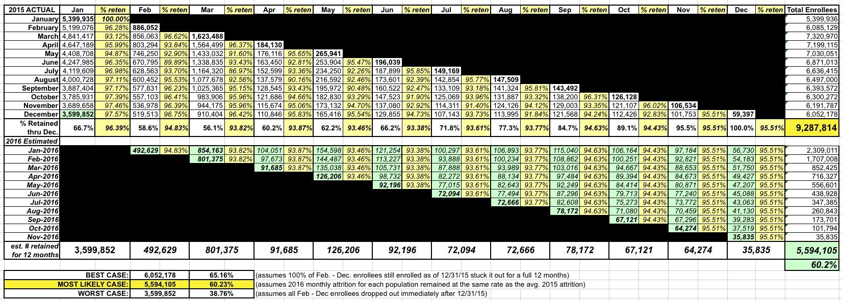
In the spreadsheet below (you'll have to click on it to view the full-size version), I first plugged in the actual enrollment/retention numbers for all 12 months of 2015 from HealthCare.Gov. The problem is that the retention numbers for each month throughout 2016 are still missing, which means I had to make assumptions based on the average monthly retention rate from throughout 2015. For instance, of those who enrolled starting in February, there was an average monthly retention rate of 94.8%, so I assumed that stayed the same for each month in 2016. Of those who started in March, the average was 93.8%, so I used that, and so on.
Using this formula for each month would result in an overall 12-month retention rate of...5.6 million people, or 60.2%...virtually identical to the actual number of enrollees who renewed or re-enrolled from December.
From my perspective, that would seem to be the "most likely case": Around 60.2%. Unfortunately, without the hard data being available for 2016 (specifically counting those who enrolled in each month of 2015), there's still no way of knowing for certain.
If you assume that Conover's math (66.7% / 78.2% = 85.3%) also carries over into the full-year vs. full-year comparison, you'd end up with 85.3% of 64.1%, or 54.7% of all 2015 HealthCare.Gov enrollees sticking it out for a full, continuous 12-month period. Under the circumstances, that actually sounds pretty viable to me.
However, this raises another problem with trying to run an apples-vs-apples comparison: In the 2006 example, I'm guessing that the vast bulk of those who stayed enrolled for the full year likely remained in the exact same healthcare policy for all 12 months, whereas in the 2015/2016 example, some number of those 5.6 million who did re-enroll switched to a different policy or even a different carrier altogether. In other words, even if all 520,000 February-start enrollees re-enrolled for 2016, a chunk of them moved to a different policy. For instance, in the fall of 2015, over a dozen Co-Ops collectively enrolling over 800,000 people went bankrupt, forcing their enrollees to shop elsewhere. Even if all 800,000 maintained continuous coverage by enrolling in a new policy starting in January 2016, from the carrier's perspective that was pretty much irrelevant, since to them, the enrollee was a brand-new customer. From their perspective, it really didn't matter how long their new enrollee had been paying premiums to their old carrier.
In conclusion, I'm not even sure that you can run a true apples-to-apples comparison between the two...and to be honest I'm starting to regret even trying.
In any event, just to reiterate: I made a major error here, but I'm leaving this post up in the interest of transparency.
UPDATE TO THE UPDATE: Larry Levitt of the Kaiser Family Foundation reminded me of this 2014 analysis of the pre-ACA individual market:
This will give you a sense of turnover in the individual insurance market before the ACA.https://t.co/pw5PDOcU9W
— Larry Levitt (@larry_levitt) May 25, 2018
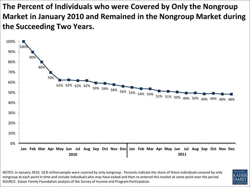
We also can use SIPP to look at how long people who have nongroup coverage keep it. One way of doing this is to look at people who had nongroup coverage at the beginning of a period and then see what percentage report having nongroup coverage at later points in time. As shown in the chart above, if we start with people who had only nongroup coverage in January, 2010, 62% still had only nongroup coverage in July, 2010, 56% still had only nongroup coverage in December, 2010, and 48% had nongroup coverage only in December, 2011. The percentages are almost identical if we look at people who had nongroup plus other coverage types and follow them over the same period. These percentages fall, however, if we look only at people who are continuously covered by nongroup coverage (e.g., they are covered by nongroup coverage for every month across the periods considered). Starting again with people reporting nongroup coverage only in January, 2010, 56% were continuously covered by nongroup coverage through July, 2010, 44% were continuously covered by nongroup coverage through December, 2010, and 31% were continuously covered through December, 2011.

This complicates things even further, as it makes it sound like the January - December enrollment level had already dropped substantially from 2006 to 2010, but again, this used a different methodology, so it's tricky to tell for sure.
Advertisement