

Data Nerd Alert! RWJF launches Interactive ACA Carrier Participation Tracker!
Wed, 09/18/2019 - 2:07pm
DISCLAIMER: ACASignups.net has a long-term paid banner ad arrangement with The Robert Wood Johnson Foundation.
I spent most of the past month knee-deep in combing through the Medical Loss Ratio rebate filings of thousands of health insurance carriers. Now, the Robert Wood Johnson Foundation has made it much easier to keep track of which of those carriers are participating in the ACA individual market:
Interactive tracker helps tell the story of insurer participation in the ACA market.
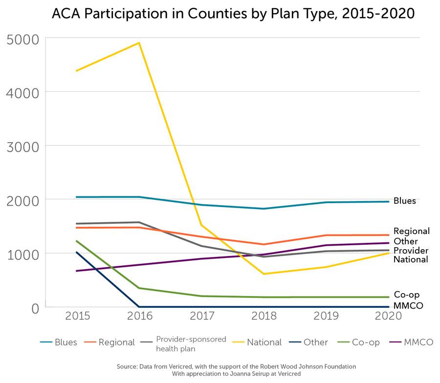
The seventh open enrollment season is almost upon us, and all signs point to growing stability, as measured by moderate premium increases and increased participation by health plans. The tracker shows the change over time in participation at the county level, and allows users to follow individual companies or categories of health insurers. The data reveal a business narrative that has been closely intertwined with the political story of the Affordable Care Act (ACA) marketplace.
It's a pretty impressive database. You can filter it by any number of the following criteria:
- COUNTY/PARISH
- YEAR (going all the way back to 2015...I don't know if 2014 will be added or not)
- EXCHANGE STATUS (offered both on & off-exchange, off-exchange only, or both)
- CARRIER NAME
- CARRIER CLASS/BRAND
The most obvious story is shown in the graph below: National participation plummeted from 2016 to 2017 as huge carriers like Aetna and UnitedHealthcare bailed on dozens of states in light of their disastrous performances in 2015 & 2016. A smaller story was the Co-Op Risk Corridor Massacre, in which nearly all of the ACA-created public/private start-up carriers were wiped out in the fall of 2015.
Since 2018, however, there's been a slow but steady rebound as the markets finally stabilize and carriers which were burnt in earlier years have started dipping their toes back in the water.
Advertisement