

UPDATED: How many could lose coverage in your CONGRESSIONAL DISTRICT?
Sat, 02/04/2017 - 5:57pm
MAJOR UPDATE 3/22/17: As I've noted repeatedly, my estimates of how many people are at risk of losing their coverage has always been based on the assumption of full repeal with immediate effect and, most importantly, no replacement healthcare policy whatsoever. I had to do it this way at first because there was no Republican replacement plan available until a couple of weeks ago. Then, when the AHCA plan was released, I didn't have the time or expertise to properly overhaul my projections accordingly.
Fortunately, the Center for American Progress does have the time, manpower and expertise to do exactly this. They crunched the numbers and, based in part on the recent Congressional Budget Office scoring of the AHCA, put together their own fully-detailed analysis of what impact partially repealing the ACA by passing the AHCA would have on coverage losses.
In light of this, at this point you can pretty much ignore everything below, as it no longer applies; the question is no longer "what happens if the ACA is repealed without anything replacing it?" but rather "what happens if the ACA is partially gutted and replaced with the AHCA?"
The amazing thing is that the grand total number losing their coverage would be virtually identical in either scenario! The numbers vary widely from state to state and district to district, but when you add it all up, it still comes in at around 24 million people either way!
Anyway, I've put together SIDE BY SIDE COMPARISON TABLES for each state here.
Unfortunately, due to the sheer amount of time it would take to do so, and the fact that the House is voting on the AHCA tomorrow (Thursday, 3/23), I don't have time to completely update/overhaul the Google Docs version of this data.
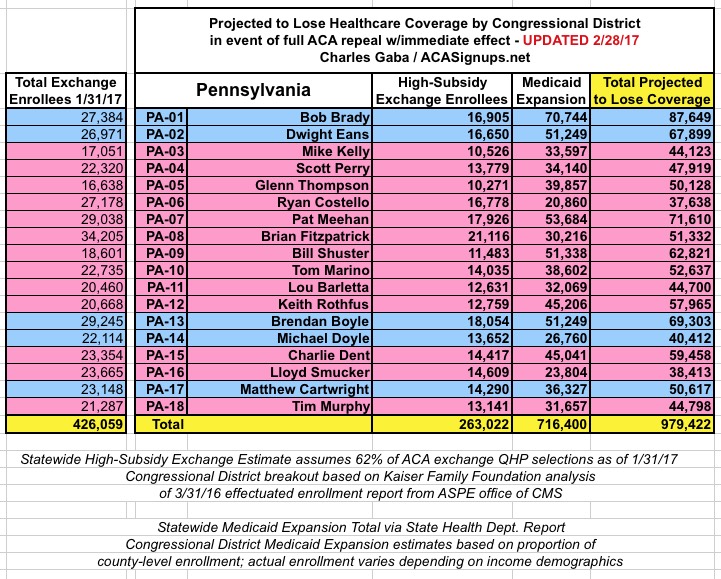
UPDATE 3/15/17: CMS has released the official 2017 Open Enrollment Report, which includes the official ACA exchange policy selection numbers as of 1/31/17, along with related demographic information. I've started the process of revising all 50 states with updated data, but this will take some time to complete. It's important to understand that most counties/congressional districts won't change by much, but I'd still prefer to have the data as up to date and accurate as possible.
GOOGLE SPREADSHEET VERSION: BY STATE
BY CONGRESSIONAL DISTRICT • BY COUNTY
CONGRESSIONAL DISTRICT INTERACTIVE MAP
UPDATE 2/19/17: NOW FEATURING ALL FIFTY STATES + DC!!
UPDATE 2/22/17: I've added the total number of exchange enrollments to the "Machine Readable" Google Docs worksheet
UPDATE 2/22/17: Now featuring Congressional office contact phone numbers (thanks to Art Nigro for the info!) and a nifty interactive map (thanks to Spencer Haley!)
Also note that I've completed the COUNTY level breakout for all 50 states (all 3,200 counties!) as well.
UPDATE 3/06/17: By request, the Google Spreadsheet now features total population and percent of population at risk in every Congressional District!
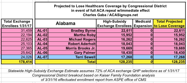
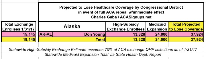
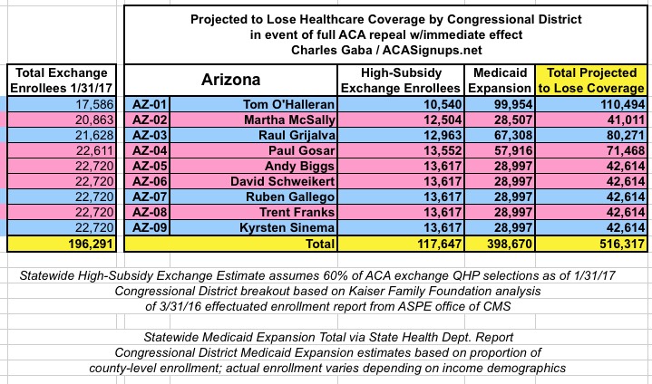
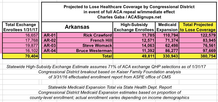
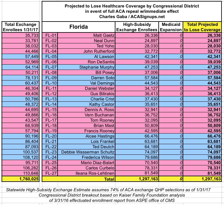
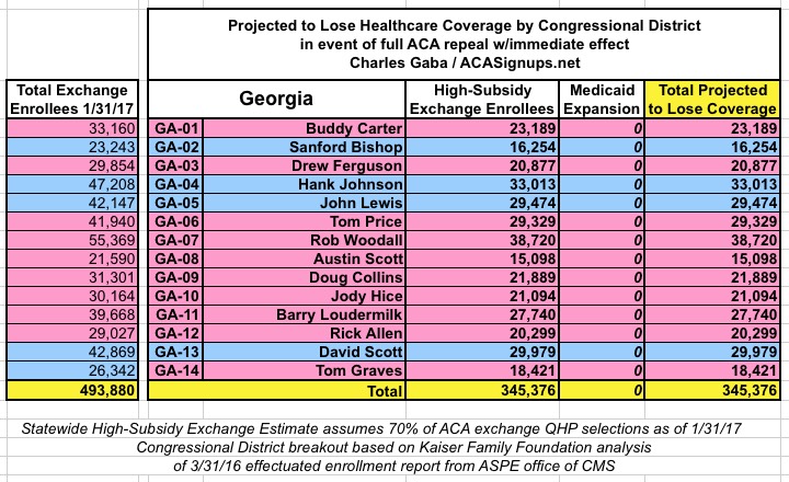
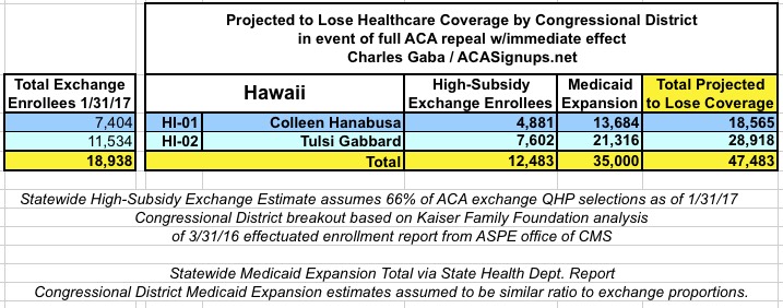
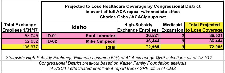
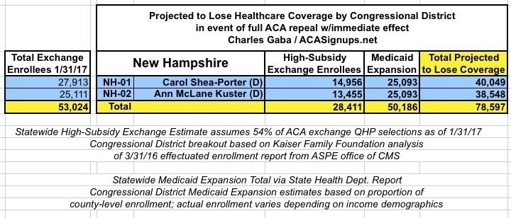
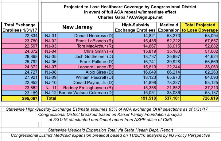
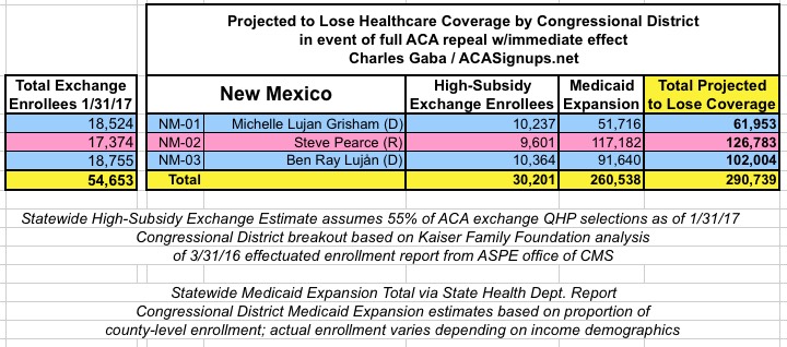
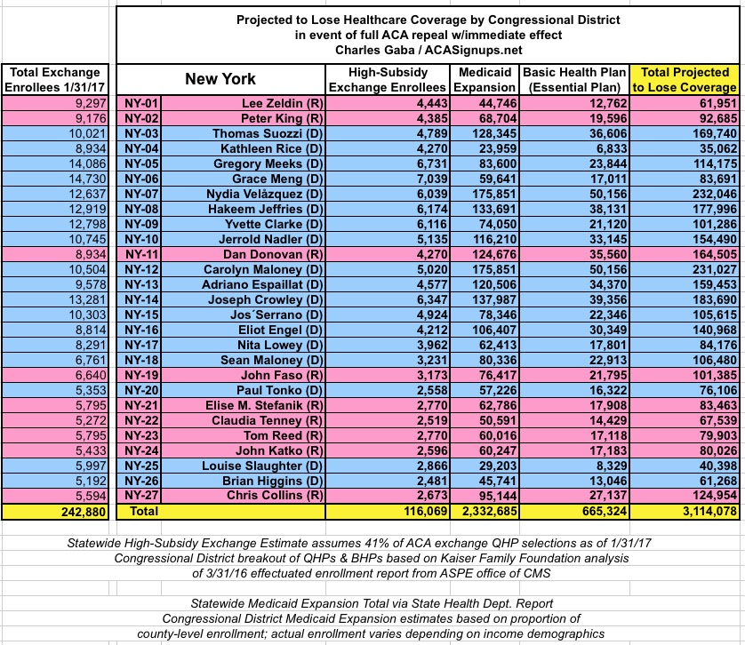
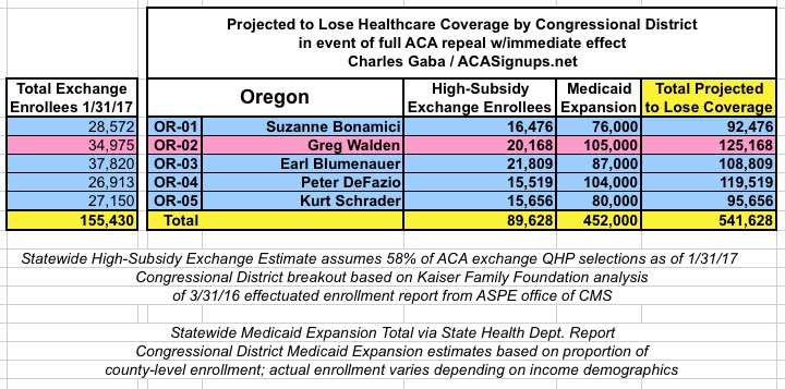
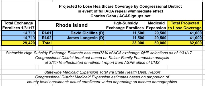
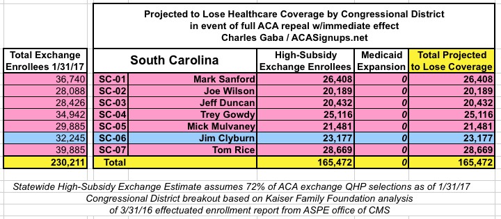
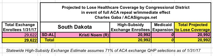
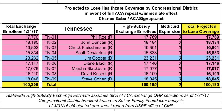
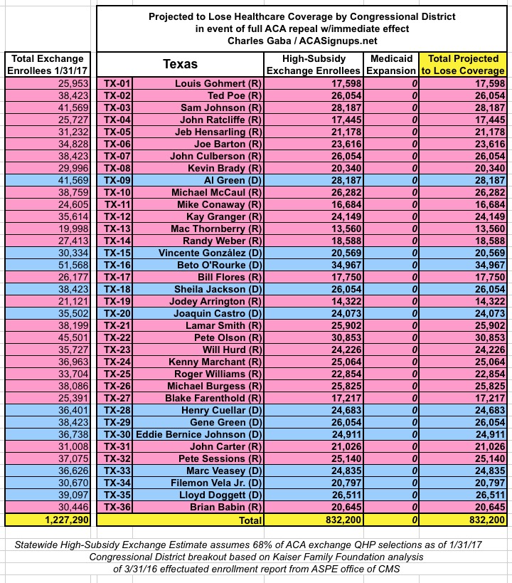
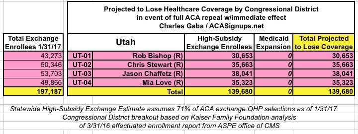
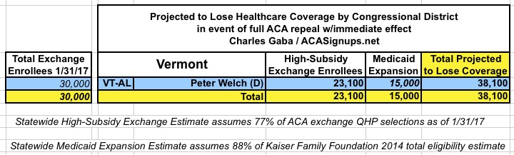
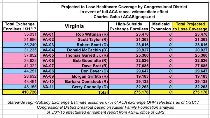
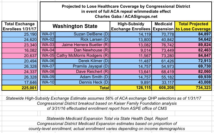
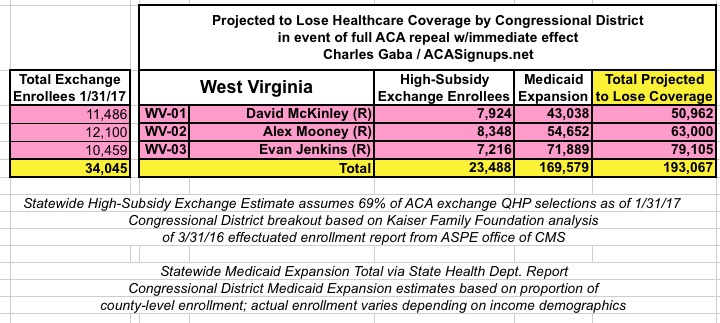
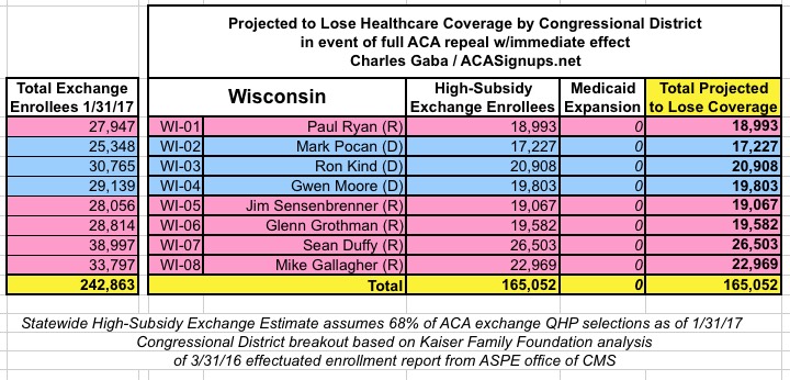
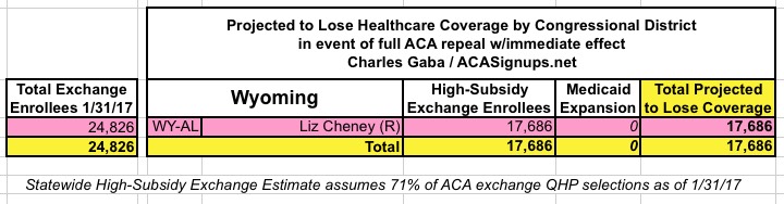
For weeks now, I've been painstakingly compiling the estimated number of people whose healthcare coverage would be at risk if the ACA is indeed repealed, by state and by county.
While my state-wide estimates cover all 50 states (+DC), I've only been able to compile this data at the county level for 35 states (DC is basically one big county anyway).
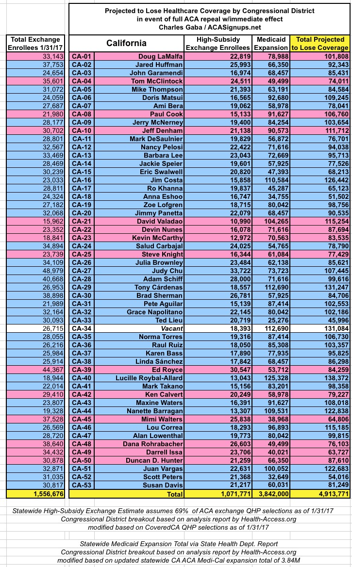
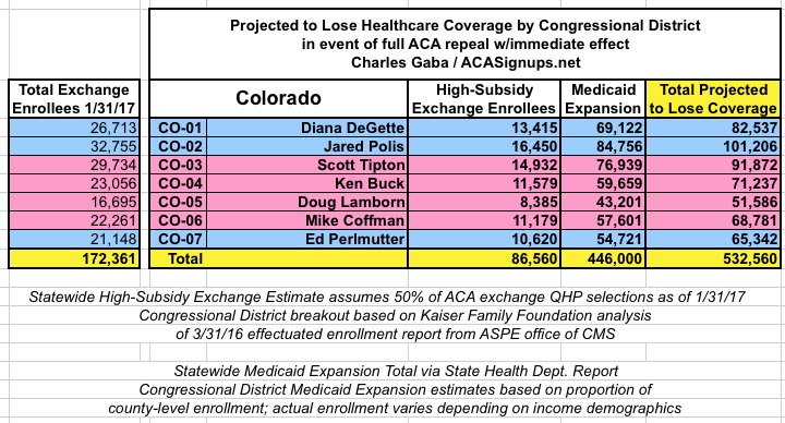
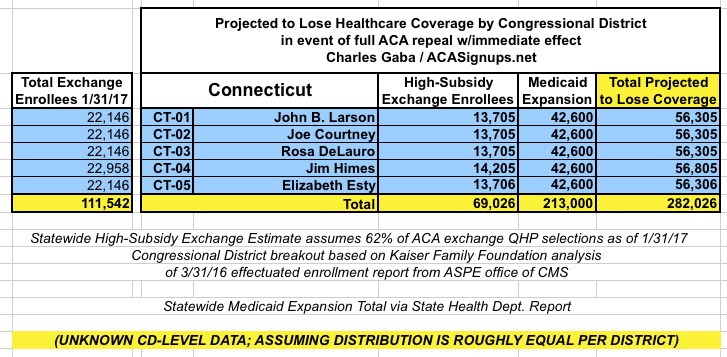
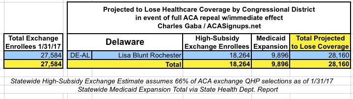
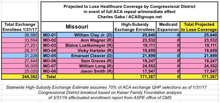
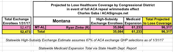
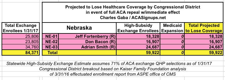
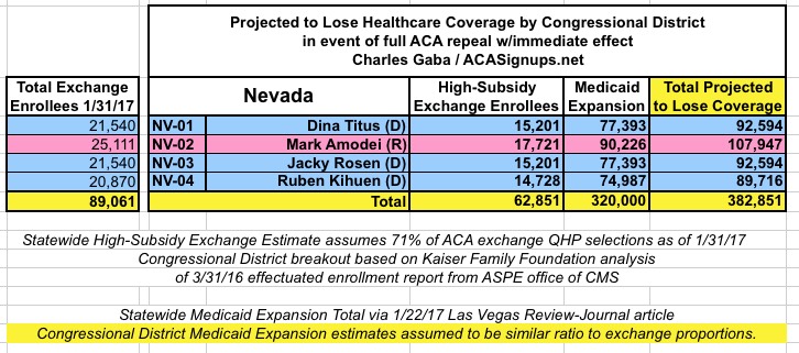
Now, by popular demand, I'm presenting my estimates of how many are at risk of losing coverage by U.S. Congressional District.
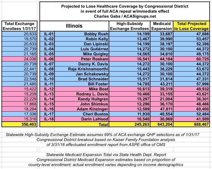
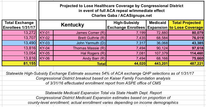
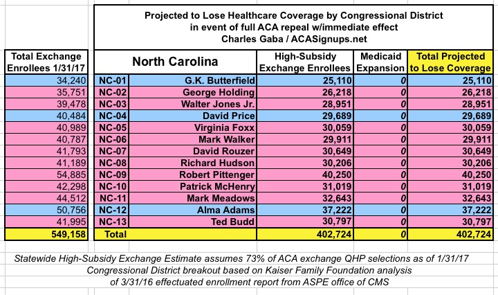
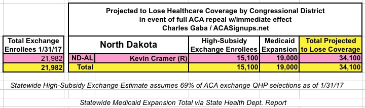
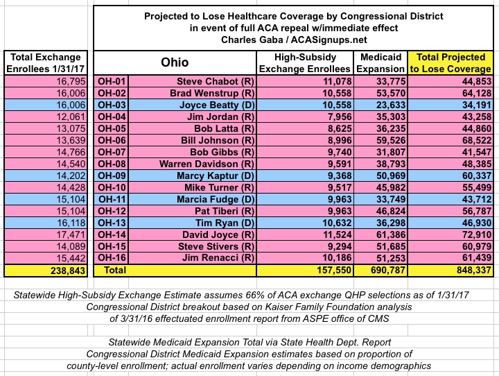
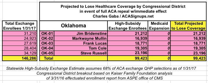
Unfortunately, like the county-level data, estimates for some states are harder to compile than others. The Kaiser Family Foundation has done the tedious work of piecing together ACA exchange Qualified Health Plan enrollment data from every zip code in each Congressional District for every single state, which is awesome, but it still takes a lot of tedious work to put together (the KFF data is embedded within an interactive map but not available for CSV/text file export, so I have to dig through every CD in every state individually).
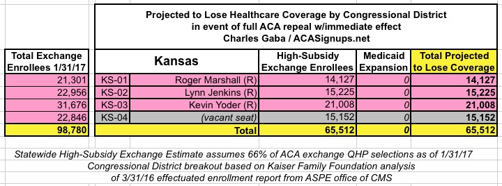
In addition, the KFF analysis doesn't include Medicaid expansion enrollees in those zip codes/Congressional Districts, so it's much easier to run estimates for the states which didn't expand Medicaid under the ACA (plus states with only a single district, duh!)
Here's the basic methodology:
For ACA Exchange enrollments:
- Start with the Kaiser Family Foundation estimates of how many were enrolled in effectuated exchange policies in each Congressional District as of March 2016.
- Divide the 1/31/17 QHP selection number proportionately based on the Kaiser estimates
For instance, a state might have had 110,000 exchange enrollees as of 3/31/16, but 120,000 as of 1/31/17. If a CD had 25,000 on 3/31/16, I'm assuming roughly 30,000 today.
- Subtract the percentage of unsubsidized enrollees (that is, people paying full price for their policies)
- Subtract another 10% on top of that, since some people are only receiving nominal tax credits (these are people who would be inconvenienced by losing the tax credits but would most likely be able to scrounge up enough money to hold onto their policies)
- Finally, I knock another 10% off of that number to account for the ~10% of enrollees who simply never pay their first monthly premium anyway, and are therefore never actually enrolled in an effectuated policy in the first place.
Nationally, this adds up to roughly 8.3 million people out of the expected 12.3 million people who selected QHPs during the 2017 Open Enrollment Period; an additional 4 million will either be paying full price or only receiving modest tax credits.
For Medicaid Expansion enrollments:
- The statewide numbers for Medicaid expansion are far more precise, as they come directly from the various state health departments or ACA exchange reports.
- Breaking these out by Congressional District, on the other hand, is much trickier, since none of the state/exchange reports break them out by CD. Instead, I have to figure out which CD every county is located in, then add up the the county-level data.
- This is made even more difficult by the fact that most counties are split into multiple CDs thanks to gerrymandering/etc. In those cases, I'm dividing the county totals by the number of CDs it's split into.
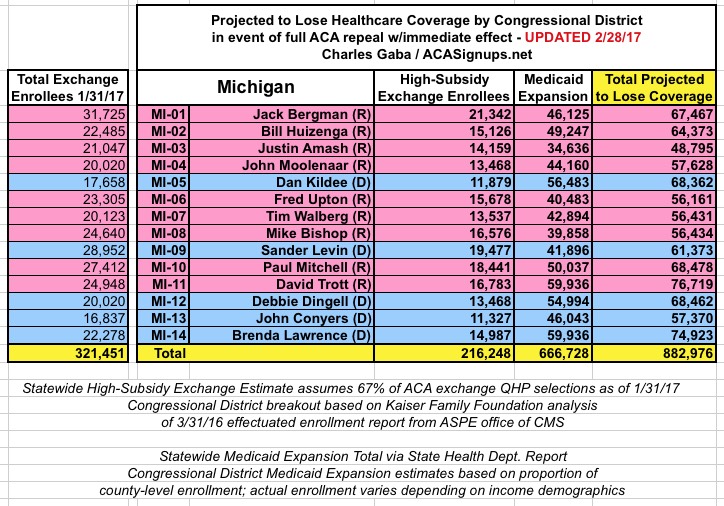
- For instance, Oakland County, Michigan has 53,868 people enrolled in ACA Medicaid Expansion. Oakland County is sliced into 4 separate CDs (MI-08, 09, 11 and 14), so I add 13,467 people into each of those Districts.
- Yes, I realize this is a simplistic system, since there's no guarantee that all 4 "chunks" of the county have equal populations, but its' the best I can do. If you have a better method, feel free to contact me, but remember I do this on my own time.
All that being said, here's what we're looking at:
- UPDATE2/17/17: CALIFORNIA now added.
- UPDATE 2/19/17: HAWAII AND IDAHO now added. (After weeks of having to track down the individual congressional districts by rolling over the appropriate part of the map--which wasn't easy in many districts due to gerrymandering--it looks like the KFF has added the actual raw source data, making it much easier to finish up the remaining states!)
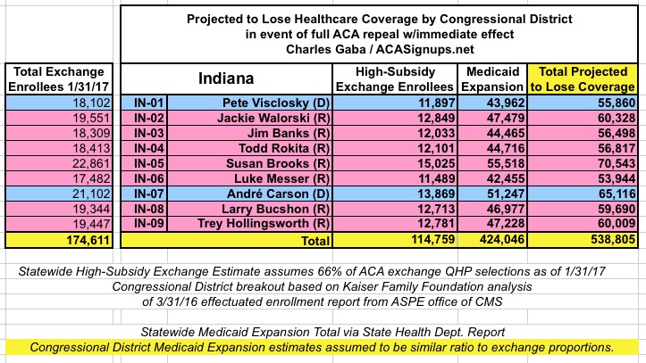
- UPDATE 2/19/17: INDIANA now added.(Important caveat: The Medicaid Expansion total may be ~74,000 too high; will correct if I receive confirmation of this)
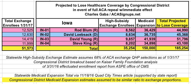
- UPDATE 2/19/17: IOWA now added.
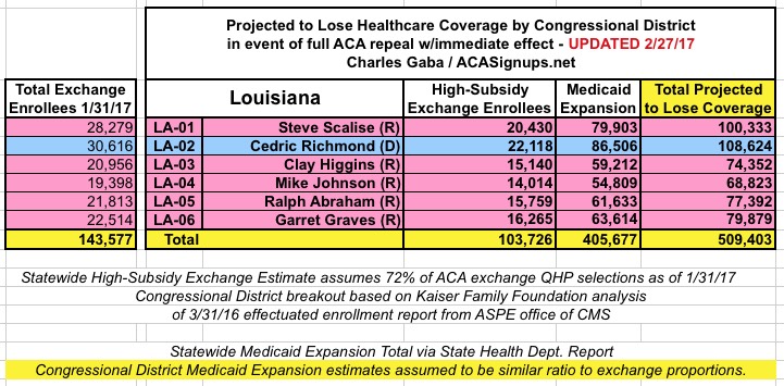
- UPDATE 2/19/17: LOUISIANA now added.
- UPDATE 2/19/17: NEVADA now added.
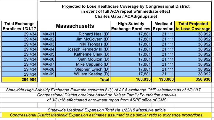
- UPDATE 2/19/17: MASSACHUSETTS now added. Two important things to note re. Massachusetts: First, until recently I was under the impression that MA had already expanded their Medicaid eligibility beyond the ACA's 138% FPL threshold anyway, and that therefore there weren't any MA residents enrolled specifically due to the ACA; it turns out that I was very, very wrong about this. According to this January 2015 MassLive article, at least 190,000 Baystaters would indeed be kicked off of Medicaid ("MassHealth") if the ACA were to be repealed.
- The second Massachusetts oddity is that the Kaiser Family Foundation analysis has all 9 Congressional Districts having the exact same number of exchange enrollees as of last March. Obvoiusly this isn't the case. KFF rounded each county off to the nearest 100, but it still seems unlikely that all 9 within the state would be that close (within +/- 50 people) regardless of the demographic/income similarities. However, in the absence of any other data sources, I have to use that as my basis...so as a result, my own estimates of both high- subsidy exchange enrollment and Medicaid expansion enrollment are also identical for each of the 9 CDs.
With the addition of Massachusetts, I've now analyzed all 50 states + DC. I'll probably be making some additional minor revisions as corrections/updated data comes in, but this should pretty much complete the project.
Advertisement