

CMS has FINALLY released the official OE5 report; let's dig in... (Part 2)
Tue, 04/03/2018 - 9:15pm
OK, I'm finally able to get back to digging into the meat of the FINALLY just-released 2018 Open Enrollment Report from the Centers for Medicare & Medicaid.
In Part 2, I'm looking at the actual 2018 Open Enrollment Period Public Use Files, which break out a ton of demographic info by state, county and even zip code depending on the state (some of it is available for all 50 states + DC, while other data is only available for the 39 states hosted by HealthCare.Gov).
First up: As I noted earlier today, there's around a 10,000 enrollee discrepancy between the national total I came up with back in early February and CMS's official total. I compared my state-by-state totals against CMS's report and found differences in 5 of the state-based exchanges:
- Colorado: CMS reports 4,013 fewer QHP selections
- District of Columbia: CMS reports 3,295 fewer QHP selections
- Massachusetts: CMS reports 3,428 fewer QHP selections
- Vermont: CMS reports 1 more QHP selection
- Washington State: CMS reports 377 more QHP selections
That gives an official national total of 11,750,175 instead of 11,760,533, or exactly 10,358 fewer enrollees than I had previously thought. The Vermont and Washington differences are barely perceptible. Colorado and Massachusetts are 1-2% off, so I might look into those. The one which really bothers me is the DC count; I had DC down as having 22,584 QHP selections based on data which came straight from the DC exchange, running about 6% ahead of 2017...but CMS says it was only 19,289 QHPs, down about 9.2%. Huh. That's quite a difference; I'll have to see where the error came from. The other 46 states all match up with what I already had, however.
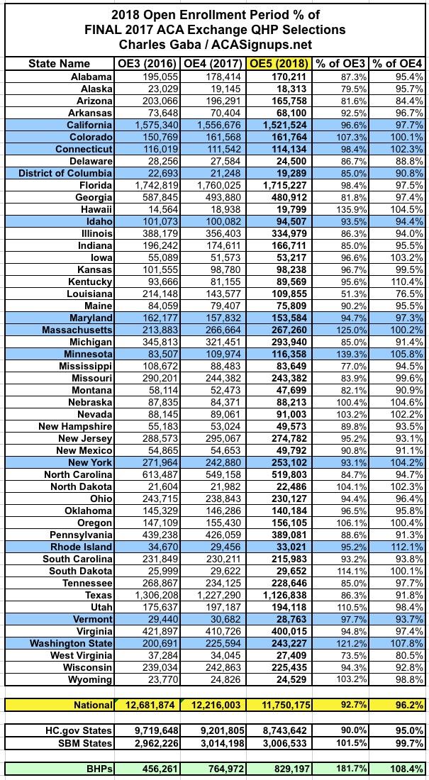
Unfortunately, with that 10K enrollment drop from the state-based exchanges, they ended up coming in slightly below last year after all (by a mere 7,700 enrollees, or less than 0.3%). This is still far better than the federal exchange, which racked up 460,000 fewer QHP signups, down 5% year over year for the 2nd year in a row.
Next, let's take a look at the renewal numbers. CMS's summary says that nationally, 73% of all 2018 enrollees are renewals and 27% are new to exchange plans. They further break that out between ACTIVE and AUTO-renewals. Actively renewing means a 2017 enrollee actively logged into their ACA exchange website account and presumably shopped around before manually selecting their 2018 policy. This is how it really should be done every year, but was especially important for 2018 given the insane impact of the CSR cut-off and Silver Loading on exchange policy pricing. I spent countless hours shouting from the rooftops that everyone should actively enroll this year, and it appears to have mostly worked, because 64% - 66% of all renewing enrollees actively renewed this year, which is up a bit from 63% who did so last year.
More interesting to me is the HC.gov vs SBM breakout: 73% of HC.gov renewals were done actively vs. only about 40% of renewals on the state-based exchanges. Huh.

OK, so nearly 2/3 of those who renewed their existing policies did so actively...but did they actually choose wisely? Well, CMS doesn't provide data for the 12 state-based exchanges, but here's what it looks like for the 39 states hosted on HC.gov:
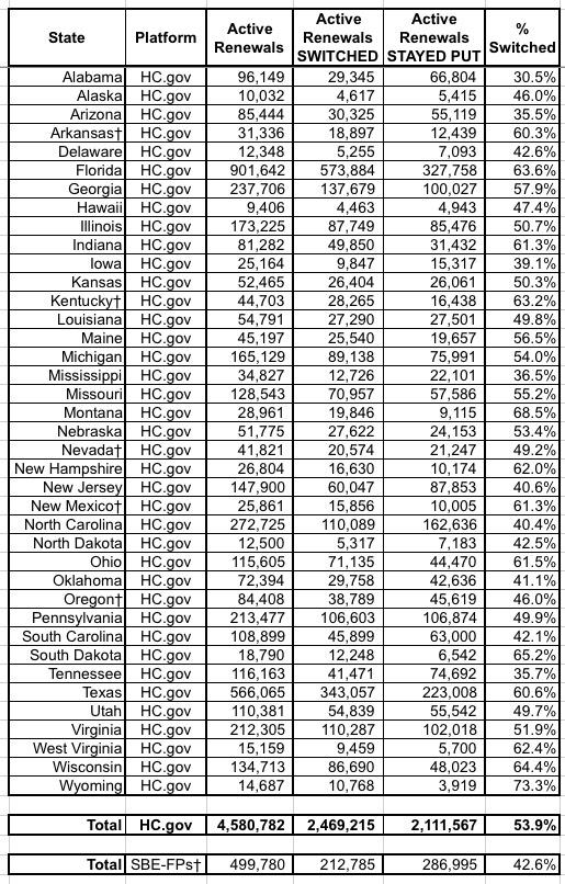
Across all 39 states, about 54% of those who actively re-enrolled switched to a different policy, which made sense for more people this year than it has in the past.
The week-by-week enrollment spreadsheet is also kind of interesting, especially the "FINAL/Extended" column. For the 39 HC.gov states, the changes here mostly represent the purging/cleaning up of the total enrollment numbers to reflect people who were denied coverage for some reason or who changed their minds and cancelled their enrollments. For the 12 state-based exchanges, it mostly shows the additional enrollments tacked on after December 15th in most of the state-based exchanges:
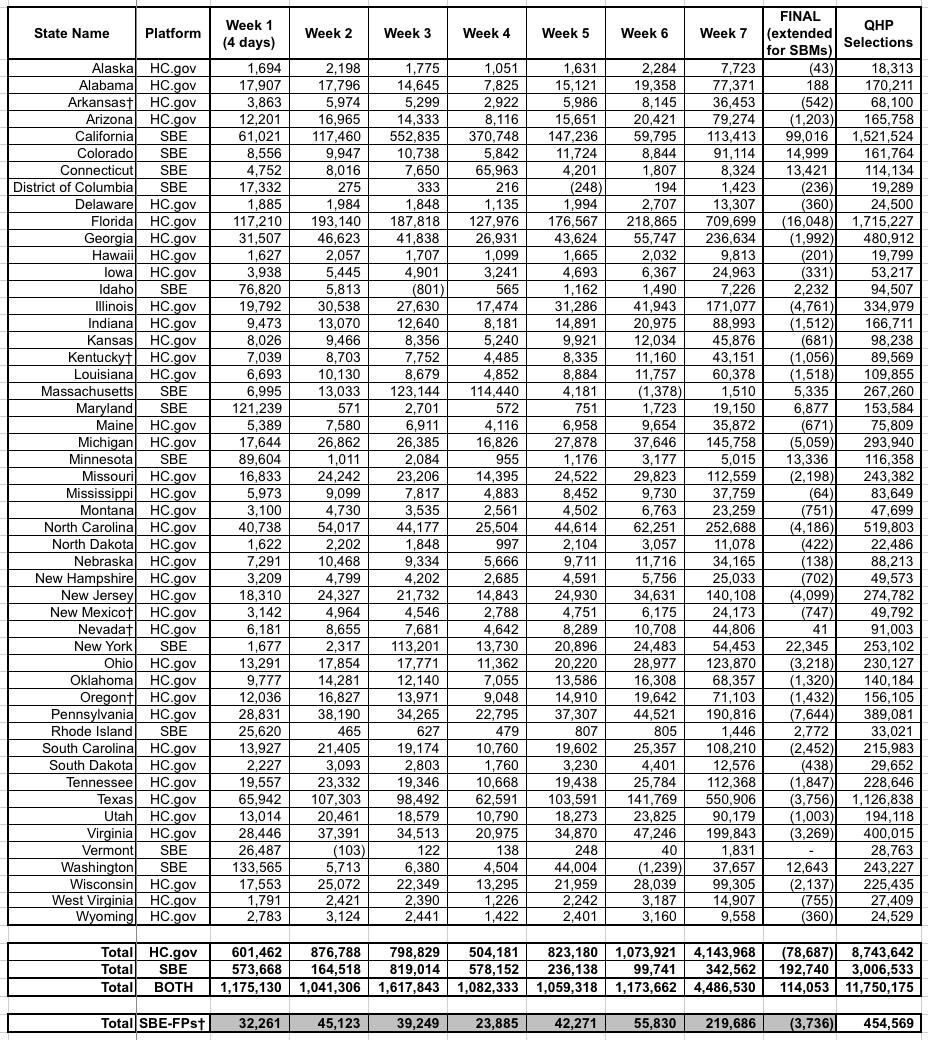
As you can see, the final QHP selection total on HC.gov states was reduced by 79,000 people (coming in 458,163 lower than 2017), while the state-based exchanges added 193,000 more people, wrapping things up with almost the exact same total as last year (just 7,665 lower).
Now comes the fun stuff: PREMIUMS, with and withou APTC subsidies:
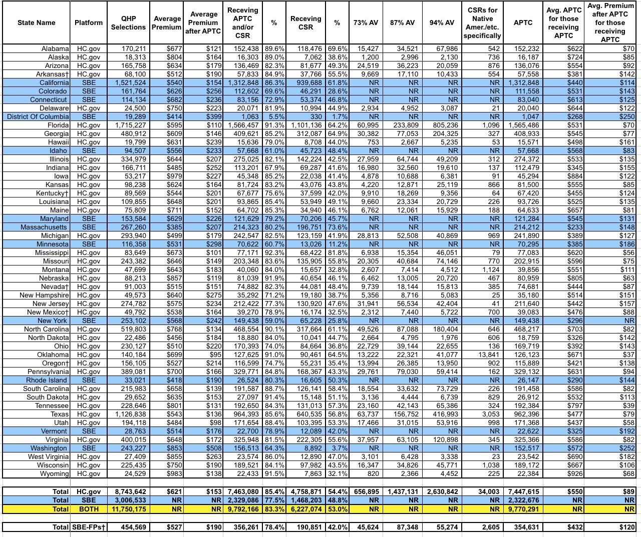
There's a lot going on here, but the most important number is probably the one in the right-hand column near the bottom: $89/month. That's the average premium amount actually being paid by about 9.8 million people each month for their insurance policies (well...for the 39 states on the federal exchange, anyway; some of the data for the state-based exchanges seems to be missing, so it might skew things up or down a bit).
This is actually 16% lower than the average for subsidized enrollees in 2017 ($106/month). Federal tax credits are covering about 87% of their premiums. You can thank Silver Loading and the Silver Switcharoo for this.
Of course, it's a very different story for the 2.0 million exchange enrollees who aren't subsidized. They, along with what I presume are another 3-4 million off-exchange individual market enrollees, are being stuck with the full bill...which is averaging $621/month, or exactly 30.5% higher on than the unsubsidized average premiums in 2017.
Wait a minute...who projected a ~30.0% average unsubsidized premium increase last October? Oh, yes...that was me. And of course, about 18 points of that was due to a combination of Trump's CSR cut-off, Silver Loading in response and fears (which would later be proven well founded) that the individual mandate would be repealed, among other sabotage efforts by Trump and Congressional Republicans.
Some other noteworthy tidbits:
- In DC, only 2% receive CSR assistance and 5% receive APTC subsidies at all. This is largely because DC has Medicaid expanded all the way out to 212% FPL, I believe.
- Similarly, only 11% of Minnesota enrollees and 26% in New York receive CSR assistance. This is because those states use the ACA's Basic Health Plan program, which is part of a separate risk pool (829,000 people enrolled between the two of them). Since BHP covers people up to 200% FPL, that only leaves the 200-250% FPL income bracket for CSR subsidies.
- What the heck is going on in Washington State, however? CMS claims that only 8,900 enrollees, or about 3.7%, are receiving CSR assistance there? That makes no sense since they don't have a BHP program, use standard Medicaid expansion and about half their enrollees earn between 100-250% FPL.
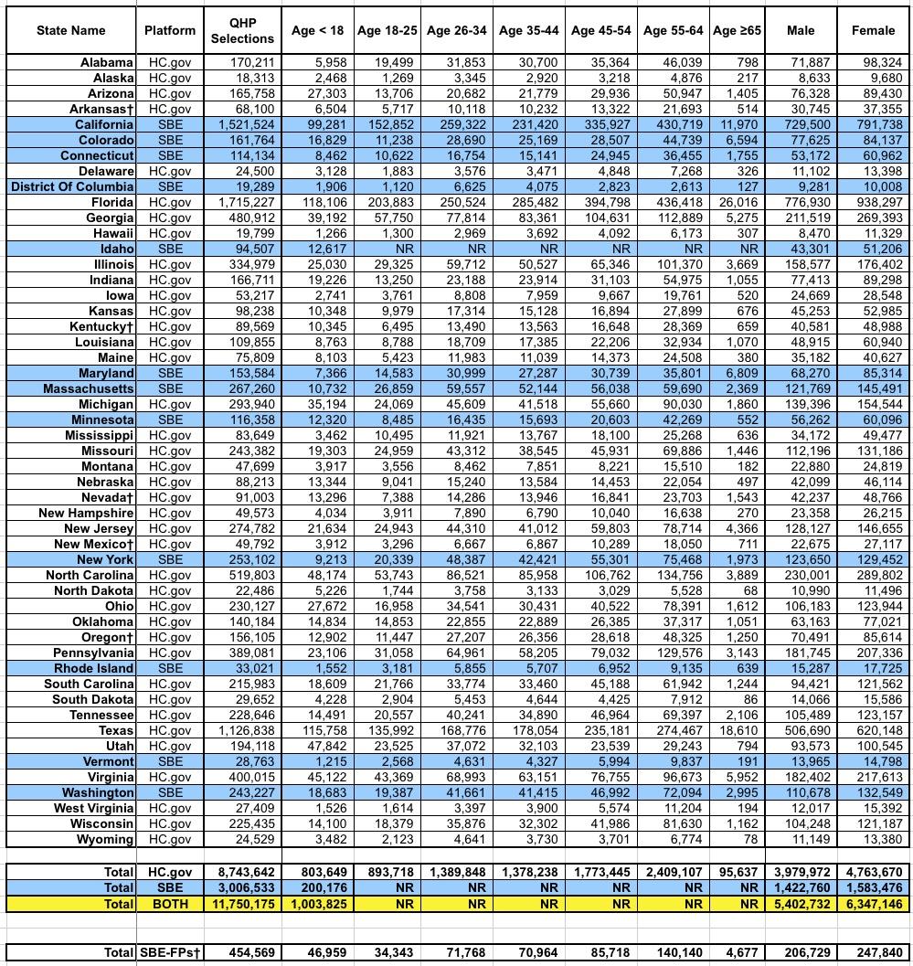
Again, 9% of enrollees are under 18; 26% are between 18-34 years old (the "Young Invincible" sweet spot that the carriers keep hoping will move up to around 40% to get a healthy mix of enrollees); 36% are 35-54 and 29% are over 55 years old. Amazingly, over 130,000 enrollees are over 65 years old, which I find fascinating since the presumption would normally be that they should be on Medicare.
Finally, let's look at the METAL LEVEL breakout. This, again, is of critical importance in seeing just how the CSR/Silver Loading strategy worked. Seeing the shift from Silver to Gold or Bronze year over year should be pretty telling:
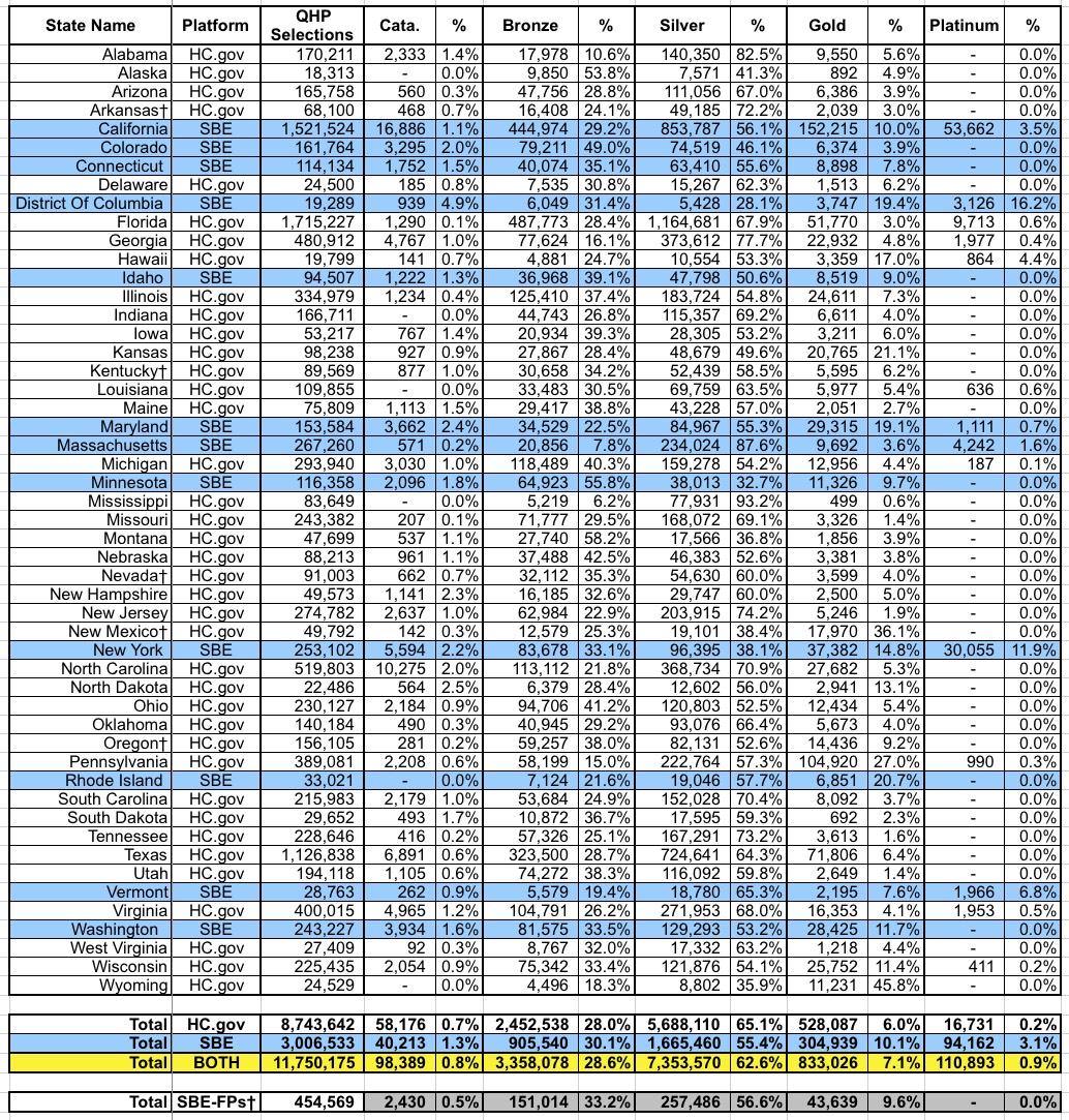
Nationally, here's how things shifted from 2017 to 2018:
- Catastrophic: 0.9% >> 0.8%
- Bronze: 22.9% >> 28.6%
- Silver: 71.1% >> 62.6%
- Gold: 4.1% >> 7.1%
- Platinum: 1.0% >> 0.9%
And there you have it: Around 1.0 million enrollees (8.5% of the total) either downgraded to Bronze (~670,000, or 5.7% of the total) or upgraded to Gold (~350,000, or 3.0% of all enrollees). While it's possible that some of these folks would have changed metal levels no matter what, the bulk of it was almost certainly due to Silver Loading.
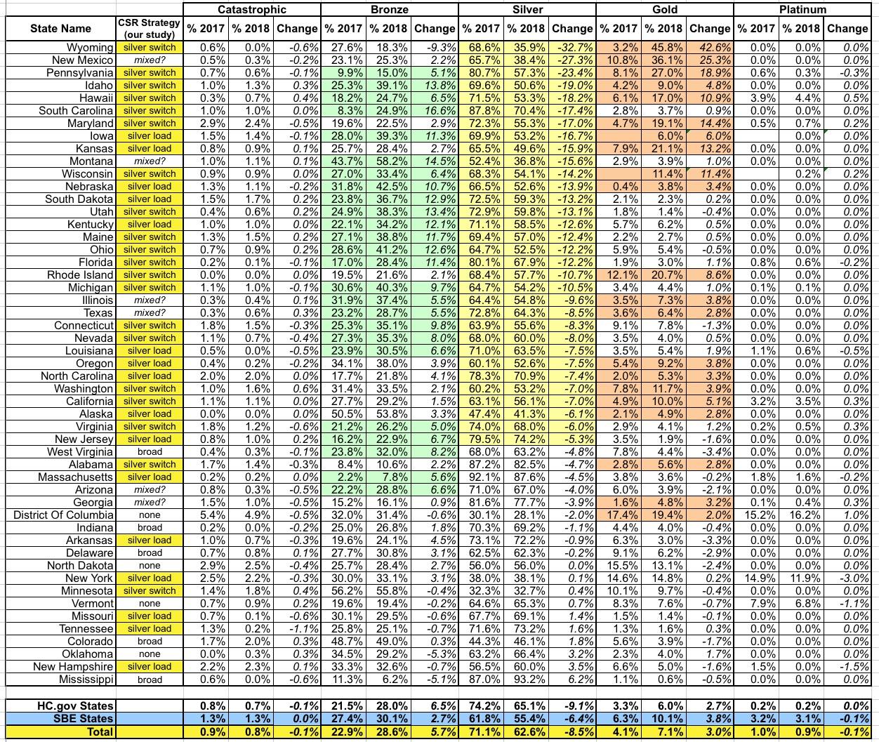
Here's how each state breaks out from 2017 to 2018 in terms of how metal level choices shifted. Since Silver plans are the default, I've sorted them from the biggest drop in Silver portion to the lowest (a few states actually saw an increase in Silver market share):
Advertisement