More than half a million Georgians have dropped health insurance coverage amid stiff premium price hikes for federally subsidized Affordable Care Act plans, according to data obtained by The Current GA and Georgia Recorder.
The 37% enrollment drop — from 1.5 million Georgians in January 2025 to 950,000 as of April 17, 2026 — dwarfs any previous decline in the state since the launch of so-called Obamacare health insurance plans in 2014.
Every year, even when the ACA is running smoothly, there are always changes in market participation, as different insurance carriers enter or exit the individual market in certain states or either expand or shrink what parts of the state they offer healthcare policies in.
2026 is no exception, and given the massive turmoil the ACA exchanges are undergoing right now (due primarily to the expiring federal tax credits as well as regulatory changes made by the Trump Regime's so-called "Integrity & Affordability Rule"), there's either 13 or 32 insurance carriers throwing in the towel in one or more states, depending on how you count a carrier operating in multiple states or under multiple subsidiary brandings.
It's important to keep in mind that the following list probably isn't comprehensive--it includes the carriers which I've confirmed are pulling out statewide (with one exception: Meridian Health Plan of Michigan is only pulling out of parts of the state). There's likely one or two that I've missed, especially given that several of these have only made their final decisions within the past week or so.
Originally posted 7/21/25; See important updates below.
It's a little awkward to try & pull quotes from Georgia's actuarial memos because they're heavily redacted (see attachments below), but fortunately I also have access to other "just the facts" filing documents which include the hard data I need to compile my weighted averages. These forms--officially called "Rate Filing Transmittal Form LH-T1" and "Unified Rate Review" forms--include, among lots of other numbers, the preliminary avg. rate change being requested for the carrier's individual (or small group) market plans, as well as the number of current effectuated enrollees they have.
In addition, I have alternate rate filings for Georgia individual market carriers which specifically state what their requested rate changes would be if the enhanced premium tax credit subsidies provided by the American Rescue Plan Act & Inflation Reduction Act were to be extended for at least one more year, providing a clear apples to apples comparison.
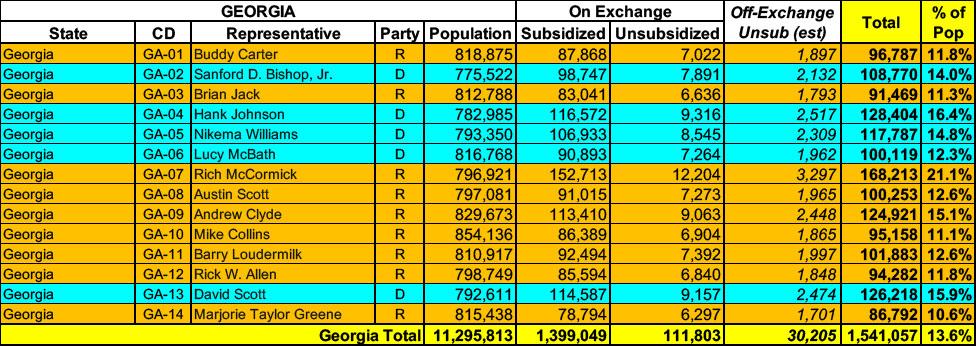
Georgia has around ~1.5 MILLION residents enrolled in ACA exchange plans, 93% of whom are currently subsidized. I estimate they also have another ~30,000 unsubsidized off-exchange enrollees.
With the 2026 ACA Open Enrollment Period officially starting on November 1st, and with millions of ACA enrollees being bombarded with scary letters from their insurance carriers and headlines warning of massive premium hikes, residents of six states* (as of this writing) can already enter their own household information to find out how much their net health insurance premiums are going to increase starting January 1st, 2026:
Twelve years ago, the Wall St. Journal ran a story about the impact of the American Taxpayer Relief Act of 2012, a sweeping tax bill signed into law by President Obama which locked in the Bush tax cuts for lower & middle-class households while allowing them to expire on schedule for wealthier Americans:
A compromise measure, the Act gives permanence to the lower rate of much of the Bush tax cuts, while retaining the higher tax rate at upper income levels that became effective on January 1 due to the expiration of the Bush tax cuts. It also establishes caps on tax deductions and credits for those at upper income levels. It does not tackle federal spending levels to a great extent, rather leaving that for further negotiations and legislation. The American Taxpayer Relief Act passed by a wide majority in the Senate, with both Democrats and Republicans supporting it, while most of the House Republicans opposed it.
With the pending dire threat to several of these programs (primarily Medicaid & the ACA) from the House Republican Budget Proposal which recently passed, I'm going a step further and am generating pie charts which visualize just how much of every Congressional District's total population is at risk of losing healthcare coverage.
USE THE DROP-DOWN MENU ABOVE TO FIND YOUR STATE & DISTRICT.
Insurance and Safety Fire Commissioner John F. King announced today that Georgia Access, the State’s health insurance marketplace, successfully concluded the 2025 Open Enrollment (OE) period, enrolling over 1.5 million consumers for Plan Year (PY) 2025, including 225,000 new consumers who were not previously enrolled in coverage through Healthcare.gov. The State’s OE 2025 period marks the success of its innovative approach and its first year as a State-based Exchange (SBE) as well as its highest enrollment year ever. Georgia Access is now the second-largest SBE in the country.