This follows prior updates of October & November 2024 Medicare enrollment data, which suggests that the Musk/Trump Admin will continue to post updated enrollment data, at least for the time being.
Whether the data posted since January 20, 2025 is accurate or not, I can't say for certain, but at least they're updating it...and I don't see anything in the December update which leaps out at me as being an obvious red flag.
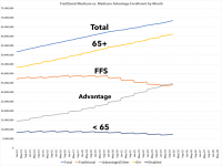
As of this writing, the same can't be said for the monthly Medicaid/CHIP enrollment reports, which are usually updated the same day as the Medicare reports, but which have remained stuck on October 2024 since before Trump was inaugurated in January.
In any event, according to the latest report, as of December 2024:
This was actually announced a few weeks ago, but I was knee-deep in my Congressional District-level Enrollment Breakout Pie Chart project so I didn't get around to posting about it until now.
Today, the Centers for Medicare & Medicaid Services (CMS) released a proposed rule to address the troubling amount of improper enrollments impacting Affordable Care Act (ACA) Health Insurance Marketplaces across the country. CMS’ 2025 Marketplace Integrity and Affordability Proposed Rule includes proposals that take critical and necessary steps to protect people from being enrolled in Marketplace coverage without their knowledge or consent, promote stable and affordable health insurance markets, and ensure taxpayer dollars fund financial assistance only for the people the ACA set out to support.
Washington, D.C. — March 27, 2025 — Today, the U.S. Department of Health and Human Services (HHS) announced a dramatic restructuring in accordance with President Trump's Executive Order, “Implementing the President’s ‘Department of Government Efficiency’ Workforce Optimization Initiative.”
The restructuring will address this and serve multiple goals without impacting critical services. First, it will save taxpayers $1.8 billion per year through a reduction in workforce of about 10,000 full-time employees who are part of this most recent transformation. When combined with HHS’ other efforts, including early retirement and Fork in the Road, the restructuring results in a total downsizing from 82,000 to 62,000 full-time employees.
That's 20,000 people, or 24% of the HHS Dept's total workforce who are losing their jobs, many of whom are in departments which are currently understaffed.
With the pending dire threat to several of these programs (primarily Medicaid & the ACA) from the House Republican Budget Proposal which recently passed, I'm going a step further and am generating pie charts which visualize just how much of every Congressional District's total population is at risk of losing healthcare coverage.
USE THE DROP-DOWN MENU ABOVE TO FIND YOUR STATE & DISTRICT.
But actually, he thought as he re-adjusted the Ministry of Plenty’s figures, it was not even forgery. It was merely the substitution of one piece of nonsense for another. Most of the material that you were dealing with had no connexion with anything in the real world, not even the kind of connexion that is contained in a direct lie. Statistics were just as much a fantasy in their original version as in their rectified version. A great deal of the time you were expected to make them up out of your head.
For example, the Ministry of Plenty’s forecast had estimated the output of boots for the quarter at 145 million pairs. The actual output was given as sixty-two millions. Winston, however, in rewriting the forecast, marked the figure down to fifty-seven millions, so as to allow for the usual claim that the quota had been overfulfilled. In any case, sixty-two millions was no nearer the truth than fifty-seven millions, or than 145 millions.
With the pending dire threat to several of these programs (primarily Medicaid & the ACA) from the House Republican Budget Proposal which recently passed, I'm going a step further and am generating pie charts which visualize just how much of every Congressional District's total population is at risk of losing healthcare coverage.
USE THE DROP-DOWN MENU ABOVE TO FIND YOUR STATE & DISTRICT.
A couple of weeks ago I expressed concern that the Musk/Trump Admin was several weeks late with publishing the latest monthly enrollment reports for Medicare, Medicaid & the Children's Health Insurance Program (CHIP).
Given that these reports have been posted on or around the first of the month for the past several years (including during the 1st Trump Admin), and especially given how much historic medical, heatlhcare & other types of data & information Musk/Trump have been furiously purging from federal government websites & data archives in their first month or so in power, this is an extremely understandable concern.
With the pending dire threat to several of these programs (primarily Medicaid & the ACA) from the House Republican Budget Proposal which recently passed, I'm going a step further and am generating pie charts which visualize just how much of every Congressional District's total population is at risk of losing healthcare coverage.
USE THE DROP-DOWN MENU ABOVE TO FIND YOUR STATE & DISTRICT.