Last September, just ahead of the 2026 ACA Open Enrollment Period, the Colorado legislature passed emergency legislation to generate funding to backfill around 40% of the premium subsidies which were lost when Congressional Republicans refused to extend the enhanced federal tax credits:
DENVER - Colorado Insurance Commissioner Michael Conway released the following statement on Governor Polis signing HB 25B-1006 into law, legislation that provides funding to the individual healthcare market to reduce catastrophic premium increases:
“I’m grateful Colorado lawmakers heeded our call about catastrophic price increases for the individual healthcare market and passed a temporary fix this special session. This stopgap measure will provide crucial funding to reduce the rise in premium costs for working families. But without Congress stepping up to extend enhanced premium tax credits, tens of thousands of hardworking Coloradans will lose their healthcare, and those who remain enrolled can expect to see average net rate increases of more than 100%, and for many, almost 200%.”
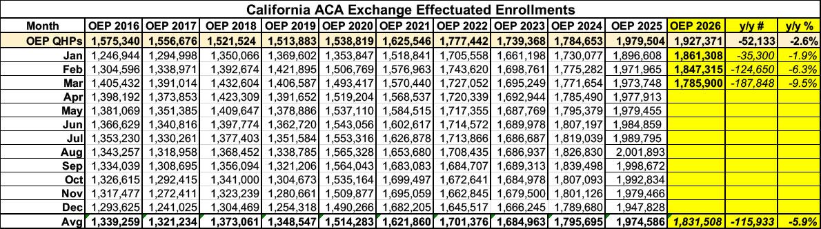
Before I begin, it's important to note that ACA exchange enrollment has dropped in California since Congressional Republicans allowed the enhanced federal subsidies to expire at the end of last year...although thanks to the state providing its own supplemental financial subsidies to partially cancel out the lost federal subsidies, it's not nearly as dramatic a drop-off as in most other states.
Effectuated enrollment was down 9.5% year over year as of March, and has almost certainly continued to drop further since then based on the trend line (see below). That's at least 187,000 fewer Californians enrolled in ACA healthcare coverage this year.
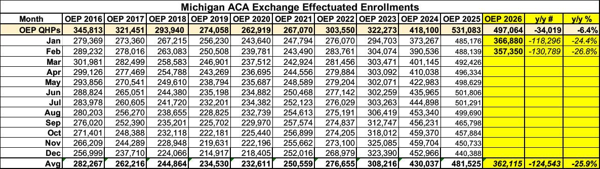
Before I begin, it's important to note that as in most states, ACA exchange enrollment has plummeted in Michigan since Congressional Republicans allowed the enhanced federal subsidies to expire at the end of last year: Effectuated enrollment was down 27% year over year as of February, and has almost certainly continued to drop further since then. That's at least 131,000 fewer Michiganders enrolled in ACA healthcare coverage this year.
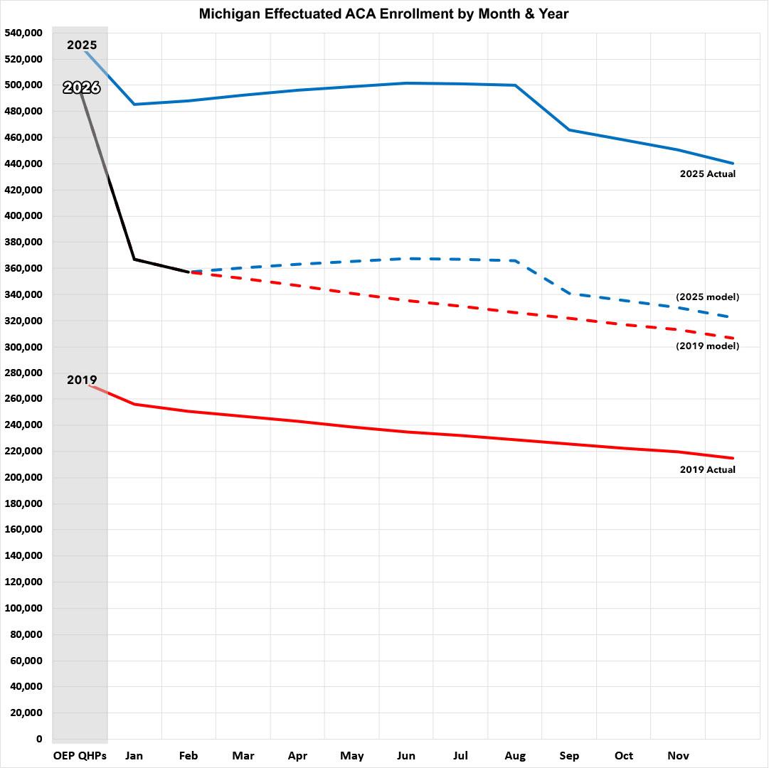
Here's what this looks like visually, with both 2025 and 2019 (the last pre-COVID year, which didn't include the enhanced subsidies) included for comparison:
About 200,000 Virginians will be eligible to tap into new state funding meant to offset costs for insurance through the state’s Affordable Care Act exchange, starting in November.
This means that participants could save about 70% on their monthly premium, after state lawmakers and Gov. Abigail Spanberger approved $150 million dollars for it in the state budget late last month.
The move comes after federal funding shifts triggered by Congress’ failure to renew expiring ACA subsidies. Thousands of Virginians have dropped their coverage so far this year as premiums have shot up.
Virginia’s Health Benefit Exchange estimates that about 100,000 Virginians have lost their health coverage this year as a result of higher premiums, according to a new press release.
Yesterday I noted that the Centers for Medicare & Medicaid Services (CMS) has published a new database which updates the official effectuated ACA exchange enrollment data for all 50 states (+DC) through February 2026.
This means that I finally have comprehensive effectuated enrollment data for the first two months of the year for every state, as opposed to only having Open Enrollment Period (OEP) plan selections, which aren't the same thing.
While there are still four months of effectuated enrollment data missing, this still fills in a lot of the missing pieces of the year over year enrollment puzzle, since this new database also includes state-level effectuations from August - December 2025 as well (previously I only had the national total for those months).
But actually, he thought as he re-adjusted the Ministry of Plenty’s figures, it was not even forgery. It was merely the substitution of one piece of nonsense for another. Most of the material that you were dealing with had no connexion with anything in the real world, not even the kind of connexion that is contained in a direct lie. Statistics were just as much a fantasy in their original version as in their rectified version. A great deal of the time you were expected to make them up out of your head.
For example, the Ministry of Plenty’s forecast had estimated the output of boots for the quarter at 145 million pairs. The actual output was given as sixty-two millions. Winston, however, in rewriting the forecast, marked the figure down to fifty-seven millions, so as to allow for the usual claim that the quota had been overfulfilled. In any case, sixty-two millions was no nearer the truth than fifty-seven millions, or than 145 millions.